/* ─────────────────────────────────────────────────────────
CAMILA MÉNDEZ PORTFOLIO — global.css
Fonts: Playfair Display + DM Sans (loaded in BaseLayout)
───────────────────────────────────────────────────────── */
*, *::before, *::after { box-sizing: border-box; margin: 0; padding: 0; }
/* ── TOKENS ──────────────────────────────────────────────── */
:root {
--bg: #E4DCD4;
--bg-subtle: #d9d1c8;
--bg-card: #ddd5cc;
--bg-nav: rgba(228,220,212,0.92);
--ink: #222222;
--ink-mid: rgba(26,26,26,0.72);
--ink-faint: rgba(26,26,26,0.08);
--accent: #4B3D8F;
--accent-light: rgba(75,61,143,0.08);
--periwinkle: #B8C5EB;
--periwinkle-faint: rgba(184,197,235,0.22);
--rule: rgba(26,26,26,0.08);
--cursor-color: rgba(75,61,143,0.88);
--cursor-glow: rgba(75,61,143,0.18);
/* Rail inactive segment blends into bg in light mode */
--rail-seg: var(--bg);
--ease-calm: cubic-bezier(0.25, 0.1, 0.25, 1);
--ease-out: cubic-bezier(0.16, 1, 0.3, 1);
}
/* ── DARK MODE ────────────────────────────────────────────── */
[data-theme="dark"] {
--bg: #3A3737;
--bg-subtle: #403D3D;
--bg-card: #4E4A49;
--bg-nav: rgba(58,55,55,0.92);
--ink: #EDE7DF;
--ink-mid: rgba(237,231,223,0.72);
--ink-faint: rgba(237,231,223,0.08);
--accent: #B8C5EB;
--accent-light: rgba(184,197,235,0.12);
--periwinkle: #7A8FC4;
--periwinkle-faint: rgba(122,143,196,0.18);
--rule: rgba(237,231,223,0.08);
--cursor-color: rgba(184,197,235,0.92);
--cursor-glow: rgba(184,197,235,0.22);
/* Rail segments visible against dark bg */
--rail-seg: rgba(237,231,223,0.18);
}
[data-theme="dark"] .form-field select option { background: #1D1915; }
[data-theme="dark"] .carousel-card { background: #2B241F; }
/* ── DARK MODE — card depth ───────────────────────────────── */
[data-theme="dark"] .project-card {
box-shadow: 0 0 0 1px rgba(237,231,223,0.07), 0 2px 14px rgba(27,24,24,0.55);
}
[data-theme="dark"] .project-card:hover {
box-shadow: 0 0 0 1px rgba(237,231,223,0.11), 0 14px 48px rgba(27,24,24,0.75);
}
[data-theme="dark"] .gallery-item {
box-shadow: 0 0 0 1px rgba(237,231,223,0.07), 0 2px 14px rgba(27,24,24,0.55);
}
[data-theme="dark"] .gallery-item:hover {
box-shadow: 0 0 0 1px rgba(237,231,223,0.11), 0 8px 32px rgba(27,24,24,0.7);
}
/* ── DARK MODE — project thumb tints ─────────────────────── */
[data-theme="dark"] .thumb--finhabits { background: #514D4D; }
[data-theme="dark"] .thumb--paramount { background: #514D4D; }
[data-theme="dark"] .thumb--health { background: #3F3F3F; }
[data-theme="dark"] .thumb--transcend { background: #514D4D; }
[data-theme="dark"] .thumb--aura { background: #3F3F3F; }
/* ── LOGOS — dark mode swap (add your own files) ──────────── */
/*
Folder structure for when you're ready:
public/images/logos/ ← light mode versions (existing)
public/images/logos/dark/ ← dark mode versions (yours to create)
In the HTML, add class="logo-light" / class="logo-dark" to swap:
*/
.logo-dark { display: none; }
[data-theme="dark"] .logo-light { display: none; }
[data-theme="dark"] .logo-dark { display: block; }
html { scroll-behavior: smooth; background: var(--bg); }
body {
background: var(--bg);
color: var(--ink);
font-family: 'DM Sans', sans-serif;
font-size: 17px;
line-height: 1.55;
-webkit-font-smoothing: antialiased;
overflow-x: hidden;
}
/* ── RAIL ─────────────────────────────────────────────────── */
.rail {
position: fixed;
left: 28px;
top: 50%;
transform: translateY(-50%);
z-index: 100;
display: flex;
flex-direction: column;
gap: 22px;
}
.rail__item {
display: flex;
align-items: center;
gap: 12px;
text-decoration: none;
color: var(--ink);
}
.rail__seg {
width: 2px; height: 18px;
border-radius: 999px;
background: var(--rail-seg);
flex-shrink: 0;
transition: width 260ms var(--ease-calm), height 260ms var(--ease-calm), background 260ms var(--ease-calm);
}
.rail__label {
font-size: 10px;
letter-spacing: 0.10em;
text-transform: uppercase;
font-weight: 600;
color: var(--ink-mid);
opacity: 0;
transform: translateX(-6px);
transition: opacity 260ms var(--ease-calm), transform 260ms var(--ease-calm), color 260ms var(--ease-calm);
white-space: nowrap;
}
.rail__item:hover .rail__label { opacity: 0.45; transform: translateX(0); }
.rail__item:hover .rail__seg { background: var(--ink-mid); }
.rail__item[data-active] .rail__label { opacity: 1; transform: translateX(0); color: var(--accent); }
.rail__item[data-active] .rail__seg { width: 3px; height: 28px; background: var(--accent); }
@media (max-width: 900px) { .rail { display: none; } }
/* ── LAYOUT ───────────────────────────────────────────────── */
.container {
max-width: 1080px;
margin: 0 auto;
padding: 0 48px 0 80px;
}
@media (max-width: 700px) { .container { padding: 0 24px; } }
/* ── WORK PAGES — wider container on large screens ─────────
Detects case-study pages (which always render .project-body).
Without the rail to reserve left-space, we get a roomier
reading column + sidebar without breaking the index. */
body:has(.project-body) .container {
max-width: 1320px;
padding: 0 64px;
}
@media (max-width: 700px) {
body:has(.project-body) .container { padding: 0 24px; }
}
/* ── WORK PAGES — theme-flipping nav accents ───────────────
Each work page locally pins --accent to periwinkle (#B8C5EB)
for both modes, which kills contrast on the back link in
light mode. Override here so:
light → indigo (#4B3D8F) dark → periwinkle (#B8C5EB)
Using high-specificity selectors so they win against the
page-scoped styles defined inside each .astro file. */
body:has(.project-body) .back:hover {
color: #4B3D8F;
}
[data-theme="dark"] body:has(.project-body) .back:hover {
color: #B8C5EB;
}
/* On mobile the .work-bottom-nav covers back-to-portfolio, so the
per-page floating .back link is redundant — hide it to keep the
case-study hero clean and prevent overlap with content. */
@media (max-width: 900px) {
body:has(.project-body) .back { display: none; }
}
/* ── NEXT PROJECT — display reveal (case studies) ──────────
Bold typographic CTA at the bottom of each case study:
small kicker, huge Playfair title, project image peeking
from the right. No card, no background — just a top rule
and lots of whitespace. Replaces the old rounded-card
pattern that was scoped inside each .astro file. */
.next-project {
position: relative;
display: grid;
grid-template-columns: minmax(0, 1.15fr) minmax(0, 1fr);
align-items: center;
gap: 56px;
text-decoration: none;
color: var(--ink);
margin: 120px 0 0;
padding: 80px 0 32px;
border-top: 1px solid var(--rule);
isolation: isolate;
}
.next-project__copy { min-width: 0; }
.next-project__label {
display: inline-flex;
align-items: center;
gap: 10px;
font-size: 11px;
letter-spacing: 0.14em;
text-transform: uppercase;
font-weight: 700;
color: #4B3D8F;
margin-bottom: 28px;
}
[data-theme="dark"] .next-project__label { color: #B8C5EB; }
/* Unified arrow icon — same line+chevron SVG used everywhere
on the page (back, label kicker, CTA), just rotated. */
.next-project__label-mark {
display: inline-flex;
align-items: center;
justify-content: center;
width: 18px;
height: 18px;
transition: transform 320ms var(--ease-out);
}
.next-project__label-mark svg {
display: block;
width: 100%;
height: 100%;
transform: rotate(-45deg); /* point up-right ↗ */
}
.next-project__label-mark svg path { stroke-width: 1.75; }
.next-project:hover .next-project__label-mark {
transform: translateX(3px) translateY(-3px);
}
/* Back arrow shares the same SVG, rotated 180° to point left */
body:has(.project-body) .back__arrow svg {
display: block;
width: 14px;
height: 14px;
transform: rotate(180deg);
}
body:has(.project-body) .back__arrow svg path { stroke-width: 1.75; }
.next-project__title {
font-family: 'Playfair Display', serif;
font-size: clamp(48px, 8.6vw, 132px);
font-weight: 500;
letter-spacing: -0.03em;
line-height: 1.08;
color: var(--ink);
margin: 0 0 36px;
transition: color 280ms var(--ease-calm);
}
/* Pad block-reveal wrappers slightly so descenders/italics
aren't clipped by overflow:hidden */
.next-project__title .block-reveal {
padding: 0.04em 0.06em 0.1em;
margin: -0.04em -0.06em -0.1em;
}
.hero__title-inner.block-reveal {
padding-bottom: 0.08em;
margin-bottom: -0.08em;
}
.next-project__title em {
font-style: italic;
font-weight: 400;
color: #4B3D8F;
}
[data-theme="dark"] .next-project__title em { color: #B8C5EB; }
.next-project:hover .next-project__title { color: #4B3D8F; }
[data-theme="dark"] .next-project:hover .next-project__title { color: #B8C5EB; }
.next-project__cta {
display: inline-flex;
align-items: center;
gap: 10px;
font-size: 13px;
font-weight: 500;
letter-spacing: 0.02em;
color: var(--ink-mid);
transition: color 220ms var(--ease-calm), gap 220ms var(--ease-out);
}
.next-project__cta svg {
width: 22px;
height: 22px;
flex-shrink: 0;
transition: transform 240ms var(--ease-out);
}
.next-project__cta svg path {
stroke-width: 1.75;
}
.next-project:hover .next-project__cta { color: var(--ink); }
.next-project:hover .next-project__cta svg { transform: translateX(3px); }
.next-project__media {
position: relative;
width: 100%;
max-width: 460px;
justify-self: end;
aspect-ratio: 5 / 4;
border-radius: 6px;
overflow: hidden;
background: var(--bg-subtle);
transform: translateY(6px);
transition: transform 420ms var(--ease-out), box-shadow 420ms var(--ease-out);
will-change: transform;
}
.next-project__media img {
width: 100%;
height: 100%;
object-fit: cover;
display: block;
transition: transform 600ms var(--ease-out), filter 320ms var(--ease-calm);
filter: saturate(0.92);
}
.next-project:hover .next-project__media {
transform: translateY(-2px);
box-shadow: 0 18px 60px rgba(26,26,26,0.14);
}
.next-project:hover .next-project__media img {
transform: scale(1.04);
filter: saturate(1);
}
@media (max-width: 900px) {
.next-project {
grid-template-columns: 1fr;
gap: 40px;
margin-top: 80px;
padding: 56px 0 24px;
}
.next-project__title { margin-bottom: 24px; }
.next-project__media {
max-width: 100%;
justify-self: stretch;
aspect-ratio: 16 / 10;
order: 2;
}
}
section {
display: flex;
flex-direction: column;
justify-content: center;
padding: 100px 0;
position: relative;
}
section:not(#hero) { min-height: 100vh; }
section + section::before {
content: '';
position: absolute;
top: 0; left: 0; right: 0;
height: 1px;
background: var(--rule);
transform: scaleX(0);
transform-origin: left;
transition: transform 900ms var(--ease-out);
}
section.line-visible::before { transform: scaleX(1); }
/* ── SECTION LABEL ────────────────────────────────────────── */
.section-label {
font-size: 10.5px;
letter-spacing: 0.11em;
text-transform: uppercase;
font-weight: 700;
color: var(--accent);
margin-bottom: 20px;
opacity: 0;
transform: translateY(8px);
display: inline-flex;
align-items: center;
gap: 8px;
}
.section-label::before {
content: '';
display: inline-block;
width: 18px;
height: 2px;
border-radius: 999px;
background: var(--periwinkle);
flex-shrink: 0;
}
.section-label.is-visible {
opacity: 1; transform: translateY(0);
transition: opacity 600ms var(--ease-out), transform 600ms var(--ease-out);
}
/* ── HERO ─────────────────────────────────────────────────── */
#hero { height: 200vh; padding: 0; display: block; }
.hero__inner {
position: sticky;
top: 0;
height: 100vh;
display: flex;
flex-direction: column;
justify-content: center;
padding: 80px 0;
will-change: transform, opacity, filter;
transform-origin: center 40%;
transition: none;
/* needed so .scroll-hint absolute is contained here */
isolation: isolate;
}
.hero__kicker {
font-size: 11.5px;
letter-spacing: 0.11em;
text-transform: uppercase;
color: var(--ink-mid);
margin-bottom: 36px;
font-weight: 400;
}
.typewriter {
display: inline-block;
overflow: hidden;
white-space: nowrap;
width: 0;
animation: type-expand 900ms var(--ease-out) 100ms forwards;
}
@keyframes type-expand { to { width: 100%; } }
.hero__title {
font-family: 'Playfair Display', serif;
font-size: clamp(38px, 5.2vw, 68px);
line-height: 1.08;
letter-spacing: -0.02em;
max-width: 22ch;
margin-bottom: 36px;
font-weight: 500;
color: var(--ink);
}
.hero__title em {
font-style: italic;
font-weight: 400;
}
/* Add a small gap between the multi-block segments so spaces
between inline-block spans don't collapse weirdly */
.hero__title .block-reveal { margin-right: 0.18em; }
.hero__title .block-reveal:last-child { margin-right: 0; }
/* ── BLOCK REVEAL UTILITY ─────────────────────────────────
Element is covered by an accent-colored block that shrinks
to one side, sweeping across to reveal the content.
Stagger is driven by a per-element --reveal-index custom
property; direction by .block-reveal--from-left. Used on
the hero, section h2s, and the next-project reveal. */
.block-reveal {
position: relative;
overflow: hidden;
isolation: isolate;
--reveal-index: 0;
--reveal-base: 120ms;
--reveal-stagger: 150ms;
--reveal-duration: 880ms;
--reveal-origin: right center;
}
.block-reveal--from-left { --reveal-origin: left center; }
/* Inline-block only for text spans. Grid/flex items keep
their original display. */
.hero__title-inner.block-reveal,
.hero__title .block-reveal,
.hero-title .block-reveal,
.next-project__title .block-reveal,
[data-reveal] > .block-reveal {
display: inline-block;
}
/* Small horizontal margin between hero blocks so the spaces
between inline-block segments don't visually collapse */
.hero-title .block-reveal { margin-right: 0.18em; }
.hero-title .block-reveal:last-child { margin-right: 0; }
.block-reveal::after {
content: '';
position: absolute;
inset: 0;
background: var(--accent);
z-index: 1;
transform: scaleX(1);
transform-origin: var(--reveal-origin);
pointer-events: none;
}
/* Auto-play on load (hero) */
.block-reveal--auto::after {
animation: block-shrink var(--reveal-duration) var(--ease-out)
calc(var(--reveal-base) + var(--reveal-index) * var(--reveal-stagger))
forwards;
}
/* Triggered when ancestor [data-reveal] gains .is-visible */
[data-reveal].is-visible .block-reveal::after,
[data-reveal].is-visible.block-reveal::after {
animation: block-shrink var(--reveal-duration) var(--ease-out)
calc(var(--reveal-base) + var(--reveal-index) * var(--reveal-stagger))
forwards;
}
/* Image reveal kicks in after the title's block has finished */
[data-reveal].is-visible .next-project__media.block-reveal {
--reveal-base: 320ms;
}
@keyframes block-shrink {
to { transform: scaleX(0); }
}
/* ── BLOCK REVEAL — case study color overrides ────────────
Case study pages locally pin --accent to periwinkle in
both modes, which would render every block the same color.
Force the standard alternation on the hero, and flip it on
the closing next-project block for a quiet, refined finish. */
body:has(.project-body) .hero-title .block-reveal::after {
background: #4B3D8F; /* violet on light */
}
[data-theme="dark"] body:has(.project-body) .hero-title .block-reveal::after {
background: #B8C5EB; /* periwinkle on dark */
}
body:has(.project-body) .next-project .block-reveal::after {
background: #B8C5EB; /* periwinkle on light — softer close */
}
[data-theme="dark"] body:has(.project-body) .next-project .block-reveal::after {
background: #4B3D8F; /* violet on dark — softer close */
}
.hero__sub {
font-size: clamp(16px, 1.45vw, 18.5px);
font-weight: 300;
max-width: 52ch;
color: var(--ink-mid);
line-height: 1.72;
opacity: 0;
transform: translateY(8px);
animation: fade-up 700ms var(--ease-out) 1600ms forwards;
}
@keyframes fade-up { to { opacity: 1; transform: translateY(0); } }
/* ── TRUSTED ──────────────────────────────────────────────── */
#trusted { min-height: auto; padding: 100px 0 160px; }
#trusted h2 {
font-family: 'Playfair Display', serif;
font-size: clamp(30px, 3.8vw, 52px);
font-weight: 400;
letter-spacing: -0.02em;
line-height: 1.1;
max-width: 22ch;
margin-bottom: 60px;
color: var(--ink);
}
.trusted-grid {
display: grid;
grid-template-columns: 1fr 1fr;
max-width: 900px;
}
@media (max-width: 700px) { .trusted-grid { grid-template-columns: 1fr; } }
.trusted-item {
padding: 32px 48px 32px 0;
border-top: 1px solid var(--rule);
opacity: 0;
transform: translateY(14px);
transition: opacity 600ms var(--ease-out), transform 600ms var(--ease-out);
display: grid;
grid-template-columns: 48px 1fr;
gap: 20px;
align-items: start;
}
.trusted-item.is-visible { opacity: 1; transform: translateY(0); }
.trusted-item:nth-child(1) { transition-delay: 0ms; }
.trusted-item:nth-child(2) { transition-delay: 80ms; }
.trusted-item:nth-child(3) { transition-delay: 160ms; }
.trusted-item:nth-child(4) { transition-delay: 240ms; }
.trusted-item__visual { padding-top: 2px; flex-shrink: 0; }
.trusted-item__visual svg { display: block; overflow: visible; }
/* ── Material Symbols base rule ───────────────────────────
Required for the loaded font's ligatures to render as
icons rather than the literal word. Used by .trusted-icon
on the home page and .cv-skill icons on /cv. */
.material-symbols-outlined {
font-family: 'Material Symbols Outlined';
font-weight: normal;
font-style: normal;
line-height: 1;
letter-spacing: normal;
text-transform: none;
display: inline-block;
white-space: nowrap;
word-wrap: normal;
direction: ltr;
-webkit-font-feature-settings: 'liga';
font-feature-settings: 'liga';
-webkit-font-smoothing: antialiased;
}
/* Trusted-grid icon (Material Symbols) — sits in the 48px column,
color follows --accent (purple light / periwinkle dark).
Animation: entrance pops in with a soft overshoot when the
parent .trusted-item enters view, then a gentle infinite
"breathing" loop kicks in. Hover adds a small tilt + lift. */
.trusted-icon {
font-size: 32px;
color: var(--accent);
display: block;
font-variation-settings: 'FILL' 0, 'wght' 400, 'GRAD' 0, 'opsz' 24;
transform: scale(0.6) rotate(-10deg);
opacity: 0;
transition:
transform 720ms cubic-bezier(0.34, 1.56, 0.64, 1) 220ms,
opacity 500ms var(--ease-out) 220ms,
color 200ms var(--ease-calm);
transform-origin: center center;
}
.trusted-item.is-visible .trusted-icon {
transform: scale(1) rotate(0);
opacity: 1;
/* Kick off the idle loop after the entrance overshoot settles */
animation: trusted-icon-breathe 4.2s ease-in-out 1100ms infinite;
}
@keyframes trusted-icon-breathe {
0%, 100% { transform: scale(1) rotate(0); }
50% { transform: scale(1.06) rotate(-1.5deg); }
}
/* Hover overrides the breathe loop with a clear, intentional pose */
.trusted-item:hover .trusted-icon {
animation: none;
transform: translateY(-2px) rotate(-4deg) scale(1.08);
}
/* Respect reduced-motion preference */
@media (prefers-reduced-motion: reduce) {
.trusted-icon,
.trusted-item.is-visible .trusted-icon { animation: none !important; }
}
/* Icon fades in slightly after the item text, no scale (scale distorts stroke widths) */
.trusted-item .trusted-item__visual {
opacity: 0;
transform: translateY(8px);
transition: opacity 500ms var(--ease-out) 180ms, transform 500ms var(--ease-out) 180ms;
}
.trusted-item.is-visible .trusted-item__visual {
opacity: 1;
transform: translateY(0);
}
/* SVG draw animation — fires when item scrolls in, delayed after icon fades in */
.trusted-item.is-visible .ti-draw {
stroke-dashoffset: 0 !important;
transition: stroke-dashoffset 600ms var(--ease-out) calc(200ms + var(--draw-delay, 0ms));
}
.trusted-item__num {
font-family: 'Playfair Display', serif;
font-size: 11px;
font-style: italic;
font-weight: 400;
color: var(--accent);
margin-bottom: 8px;
letter-spacing: 0.04em;
}
.trusted-item p {
font-size: 15px;
line-height: 1.65;
color: var(--ink-mid);
font-weight: 300;
}
/* ── TRUSTED BY MARQUEE ───────────────────────────────────── */
.trusted-by {
margin-top: 56px;
padding-top: 40px;
border-top: 1px solid var(--rule);
opacity: 0;
transform: translateY(10px);
transition: opacity 600ms var(--ease-out) 320ms, transform 600ms var(--ease-out) 320ms;
}
.trusted-by.is-visible { opacity: 1; transform: translateY(0); }
.trusted-by__label {
font-size: 10px;
letter-spacing: 0.13em;
text-transform: uppercase;
font-weight: 600;
color: var(--ink-mid);
opacity: 0.45;
margin-bottom: 24px;
}
.marquee-wrapper {
position: relative;
overflow: hidden;
-webkit-mask-image: linear-gradient(to right, transparent 0%, black 10%, black 90%, transparent 100%);
mask-image: linear-gradient(to right, transparent 0%, black 10%, black 90%, transparent 100%);
}
.marquee-track {
display: flex;
align-items: center;
gap: 64px;
width: max-content;
animation: marquee-scroll 28s linear infinite;
}
.marquee-wrapper:hover .marquee-track { animation-play-state: paused; }
@keyframes marquee-scroll {
0% { transform: translateX(0); }
100% { transform: translateX(-50%); }
}
/*
─────────────────────────────────────────────────────────
LOGO ITEMS — replace .logo-item span with real ![]() tags
when you have actual logo files. See README comments below.
─────────────────────────────────────────────────────────
*/
.logo-item {
display: flex;
align-items: center;
justify-content: center;
height: 32px;
opacity: 0.38;
transition: opacity 200ms var(--ease-calm), filter 200ms var(--ease-calm);
flex-shrink: 0;
filter: grayscale(1);
}
.logo-item:hover { opacity: 0.72; filter: grayscale(0); }
.logo-item span {
font-family: 'Playfair Display', serif;
font-size: 16px;
font-weight: 500;
letter-spacing: -0.01em;
color: var(--ink);
white-space: nowrap;
}
/* When using real logo images: */
.logo-item img {
height: auto;
width: auto;
max-height: 28px;
max-width: 120px;
display: block;
}
/* ── WORK SECTION ─────────────────────────────────────────── */
#work { min-height: auto; padding-bottom: 80px; }
#work h2 {
font-family: 'Playfair Display', serif;
font-size: clamp(30px, 3.8vw, 52px);
font-weight: 400;
letter-spacing: -0.02em;
line-height: 1.1;
margin-bottom: 12px;
color: var(--ink);
}
.work-intro {
font-size: 15px;
font-weight: 300;
color: var(--ink-mid);
margin-bottom: 48px;
max-width: 56ch;
}
.projects-grid {
display: grid;
grid-template-columns: repeat(2, 1fr);
gap: 20px;
}
.projects-grid--bottom {
display: grid;
grid-template-columns: repeat(3, 1fr);
gap: 20px;
margin-top: 20px;
}
@media (max-width: 900px) { .projects-grid--bottom { grid-template-columns: repeat(2, 1fr); } }
@media (max-width: 720px) {
.projects-grid { grid-template-columns: 1fr; }
.projects-grid--bottom { grid-template-columns: 1fr; }
}
/* ── PROJECT CARD ─────────────────────────────────────────── */
.project-card {
display: block;
text-decoration: none;
color: var(--ink);
background: var(--bg-card);
border-radius: 12px;
overflow: hidden;
opacity: 0;
transform: translateY(16px);
transition:
opacity 550ms var(--ease-out),
transform 550ms var(--ease-out),
box-shadow 280ms var(--ease-calm);
}
.project-card.is-visible { opacity: 1; transform: translateY(0); }
.project-card:nth-child(1) { transition-delay: 0ms; }
.project-card:nth-child(2) { transition-delay: 90ms; }
.project-card:nth-child(3) { transition-delay: 180ms; }
.project-card:nth-child(4) { transition-delay: 270ms; }
.project-card:hover { box-shadow: 0 8px 40px rgba(26,26,26,0.10); }
.project-card__thumb {
width: 100%;
aspect-ratio: 16/9;
background: var(--bg-subtle);
position: relative;
overflow: hidden;
display: flex;
align-items: center;
justify-content: center;
}
.project-card__thumb::after {
content: '';
position: absolute;
inset: 0;
background: linear-gradient(to bottom, transparent 60%, rgba(26,26,26,0.06));
pointer-events: none;
}
/* When you add a real thumbnail image, the img fills the thumb div */
.project-card__thumb img {
width: 100%;
height: 100%;
object-fit: cover;
display: block;
transition: transform 400ms var(--ease-out);
}
.project-card:hover .project-card__thumb img { transform: scale(1.03); }
/* SVG placeholder inner (remove once you have real images) */
.project-card__thumb-inner {
width: 100%; height: 100%;
display: flex;
align-items: center;
justify-content: center;
color: var(--ink-mid);
transition: transform 400ms var(--ease-out);
}
.project-card:hover .project-card__thumb-inner { transform: scale(1.03); }
.project-card__thumb-inner svg { opacity: 0.22; }
/* thumb tint colours (used as fallback bg when no image) */
.thumb--finhabits { background: #e8eaf6; }
.thumb--paramount { background: #f3e8e8; }
.thumb--health { background: #e8f0e8; }
.thumb--transcend { background: #f0ece8; }
.thumb--aura { background: #ede8f5; }
.projects-grid--bottom .project-card:nth-child(1) { transition-delay: 180ms; }
.projects-grid--bottom .project-card:nth-child(2) { transition-delay: 270ms; }
.projects-grid--bottom .project-card:nth-child(3) { transition-delay: 360ms; }
.project-card__body {
padding: 22px 24px 24px;
display: flex;
align-items: flex-start;
justify-content: space-between;
gap: 16px;
min-width: 0;
}
.project-card__meta { flex: 1 1 auto; min-width: 0; }
.project-card__title {
font-family: 'Playfair Display', serif;
font-size: 20px;
font-weight: 400;
margin-bottom: 6px;
color: var(--ink);
line-height: 1.2;
}
.project-card__summary {
font-size: 13.5px;
color: var(--ink-mid);
line-height: 1.5;
font-weight: 300;
max-width: 38ch;
overflow-wrap: anywhere;
}
.project-card__arrow {
display: inline-flex;
align-items: center;
justify-content: center;
color: var(--accent);
opacity: 0.55;
transform: translateX(0) translateY(2px);
transition: opacity 220ms var(--ease-calm), transform 220ms var(--ease-out);
flex-shrink: 0;
margin-top: 2px;
}
.project-card:hover .project-card__arrow {
opacity: 1;
transform: translateX(4px) translateY(2px);
}
.project-card__tag {
display: inline-block;
font-size: 10px;
letter-spacing: 0.08em;
text-transform: uppercase;
font-weight: 700;
color: var(--accent);
background: var(--accent-light);
border-radius: 999px;
padding: 3px 10px;
margin-bottom: 10px;
}
/* ── MORE WORK — DARK CAROUSEL ────────────────────────────── */
#more-work {
min-height: 100vh;
padding: 100px 0;
background: var(--bg);
display: flex;
flex-direction: column;
justify-content: center;
will-change: transform, opacity, filter;
}
/* Trusted also gets will-change for parallax */
#trusted { will-change: transform, opacity, filter; }
.carousel-inner {
padding: 80px 0 80px;
width: 100%;
}
.carousel-header {
display: flex;
align-items: flex-end;
justify-content: space-between;
padding: 0 80px;
margin-bottom: 48px;
gap: 24px;
}
@media (max-width: 700px) { .carousel-header { padding: 0 24px; flex-direction: column; align-items: flex-start; gap: 24px; } }
.carousel-label { color: var(--periwinkle) !important; }
.carousel-label::before { background: var(--periwinkle) !important; }
.carousel-title {
font-family: 'Playfair Display', serif;
font-size: clamp(26px, 3.2vw, 44px);
font-weight: 400;
letter-spacing: -0.02em;
line-height: 1.08;
color: rgba(255,255,255,0.92);
margin-bottom: 10px;
}
.carousel-sub {
font-size: 14px;
font-weight: 300;
color: rgba(255,255,255,0.38);
line-height: 1.6;
max-width: 44ch;
}
/* Nav */
.carousel-nav {
display: flex;
align-items: center;
gap: 16px;
flex-shrink: 0;
}
.carousel-btn {
width: 40px; height: 40px;
border-radius: 50%;
border: 1.5px solid var(--periwinkle);
background: transparent;
color: var(--periwinkle);
display: flex; align-items: center; justify-content: center;
cursor: pointer;
transition: background 200ms, color 200ms;
flex-shrink: 0;
}
.carousel-btn:hover { background: var(--periwinkle); color: #1a1a1a; }
.carousel-btn:disabled { opacity: 0.25; cursor: default; }
.carousel-counter {
font-size: 12px;
letter-spacing: 0.08em;
color: rgba(255,255,255,0.35);
font-weight: 500;
min-width: 36px;
text-align: center;
}
/* Viewport + track */
.carousel-viewport {
overflow: hidden;
padding: 0 80px;
position: relative;
}
@media (max-width: 700px) { .carousel-viewport { padding: 0 24px; } }
:root {
--card-w: 72vw;
--card-gap: 24px;
}
@media (max-width: 700px) { :root { --card-w: 82vw; } }
.carousel-track {
display: flex;
gap: var(--card-gap);
transform: translateX(0);
transition: transform 480ms cubic-bezier(0.25, 1, 0.3, 1);
will-change: transform;
cursor: grab;
}
.carousel-track:active { cursor: grabbing; }
/* Cards */
.carousel-card {
flex: 0 0 var(--card-w);
border-radius: 12px;
overflow: hidden;
background: #252525;
position: relative;
user-select: none;
cursor: pointer;
}
.carousel-card__img {
width: 100%;
aspect-ratio: 16/9;
overflow: hidden;
position: relative;
display: flex;
align-items: center;
justify-content: center;
background: #2a2a2a;
}
.carousel-card__img img {
width: 100%;
height: 100%;
object-fit: cover;
display: block;
transition: transform 400ms cubic-bezier(0.25,1,0.3,1);
pointer-events: none;
}
.carousel-card:hover .carousel-card__img img { transform: scale(1.03); }
.carousel-card__info {
padding: 18px 22px 22px;
}
.carousel-card__tag {
display: inline-block;
font-size: 9.5px;
letter-spacing: 0.10em;
text-transform: uppercase;
font-weight: 700;
color: var(--periwinkle);
margin-bottom: 6px;
}
.carousel-card__title {
font-family: 'Playfair Display', serif;
font-size: 18px;
font-weight: 400;
color: rgba(255,255,255,0.82);
line-height: 1.2;
}
/* Dots */
.carousel-dots {
display: flex;
align-items: center;
gap: 8px;
padding: 32px 80px 0;
}
@media (max-width: 700px) { .carousel-dots { padding: 24px 24px 0; } }
.carousel-dot {
width: 6px; height: 6px;
border-radius: 50%;
border: none;
background: rgba(255,255,255,0.18);
cursor: pointer;
transition: background 200ms, transform 200ms;
padding: 0;
}
.carousel-dot.is-active {
background: var(--periwinkle);
transform: scale(1.3);
}
/* ── GALLERY GRID (more-work section) ────────────────────── */
.gallery-grid {
display: grid;
grid-template-columns: repeat(4, 1fr);
gap: 16px;
}
@media (max-width: 1100px) { .gallery-grid { grid-template-columns: repeat(3, 1fr); } }
@media (max-width: 800px) { .gallery-grid { grid-template-columns: repeat(2, 1fr); } }
/* ── Mobile carousel (≤600px) ────────────────────────────── */
@media (max-width: 600px) {
.gallery-grid {
display: flex;
flex-direction: row;
overflow-x: scroll;
overflow-y: hidden;
scroll-snap-type: x mandatory;
-webkit-overflow-scrolling: touch;
scrollbar-width: none;
gap: 12px;
padding: 0 24px 8px;
align-items: flex-start;
}
.gallery-grid::-webkit-scrollbar { display: none; }
.gallery-item {
flex: 0 0 78vw;
max-width: 300px;
scroll-snap-align: start;
height: auto;
min-height: 0;
/* reset grid transition delays on mobile */
transition-delay: 0ms !important;
}
.gallery-item__img {
aspect-ratio: 3 / 4;
width: 100%;
overflow: hidden;
}
.gallery-item__img img {
width: 100%;
height: 100%;
object-fit: cover;
display: block;
}
}
/* ── Gallery dots (injected by JS, needs global scope) ───── */
.gallery-dots {
display: none;
justify-content: center;
align-items: center;
gap: 10px;
margin-top: 20px;
padding: 0 24px;
}
.gallery-dot {
width: 7px;
height: 7px;
border-radius: 50%;
border: none;
background: #b8aee0;
opacity: 0.5;
padding: 0;
cursor: pointer;
transition: background 0.25s, opacity 0.25s, transform 0.25s;
flex-shrink: 0;
}
.gallery-dot.is-active {
background: #4B3D8F;
opacity: 1;
transform: scale(1.5);
}
/* More work header — aligns naturally with .container, no extra inset */
#more-work .section-label { color: var(--accent) }
#more-work .section-label::before { background: var(--periwinkle) }
#more-work h2 {
font-family: 'Playfair Display', serif;
font-size: clamp(26px, 3.2vw, 44px);
font-weight: 400;
letter-spacing: -0.02em;
line-height: 1.08;
color: var(--ink);
margin-bottom: 10px;
}
.more-work-sub {
font-size: 14px;
font-weight: 300;
color: var(--ink-mid);
line-height: 1.6;
max-width: 44ch;
margin-bottom: 48px;
}
.gallery-item {
border-radius: 8px;
overflow: hidden;
position: relative;
cursor: pointer;
opacity: 0;
transform: translateY(12px);
transition: opacity 500ms var(--ease-out), transform 500ms var(--ease-out), box-shadow 250ms var(--ease-calm);
}
.gallery-item.is-visible { opacity: 1; transform: translateY(0); }
.gallery-item:nth-child(1) { transition-delay: 0ms; }
.gallery-item:nth-child(2) { transition-delay: 60ms; }
.gallery-item:nth-child(3) { transition-delay: 120ms; }
.gallery-item:nth-child(4) { transition-delay: 180ms; }
.gallery-item:hover { box-shadow: 0 6px 28px rgba(26,26,26,0.12); }
.gallery-item__img {
width: 100%;
aspect-ratio: 3/4;
background: var(--bg-subtle);
position: relative;
display: flex;
align-items: center;
justify-content: center;
overflow: hidden;
}
/* Real image inside gallery item */
.gallery-item__img img {
width: 100%;
height: 100%;
object-fit: cover;
display: block;
transition: transform 350ms var(--ease-out);
}
.gallery-item:hover .gallery-item__img img { transform: scale(1.04); }
.gallery-item__img::before {
content: '';
position: absolute;
inset: 0;
background: linear-gradient(to bottom, transparent 40%, rgba(26,26,26,0.45));
z-index: 1;
opacity: 0;
transition: opacity 250ms var(--ease-calm);
}
.gallery-item:hover .gallery-item__img::before { opacity: 1; }
.gallery-item__caption {
position: absolute;
bottom: 0; left: 0; right: 0;
padding: 16px 14px 14px;
z-index: 2;
transform: translateY(6px);
opacity: 0;
transition: opacity 250ms var(--ease-calm), transform 250ms var(--ease-calm);
}
.gallery-item:hover .gallery-item__caption { opacity: 1; transform: translateY(0); }
.gallery-item__caption span {
font-size: 11px;
font-weight: 500;
letter-spacing: 0.07em;
text-transform: uppercase;
color: rgba(255,255,255,0.92);
}
.gallery-item--soon .gallery-item__img {
border: 1.5px dashed var(--rule);
background: transparent;
}
.gallery-soon-label {
font-size: 10px;
letter-spacing: 0.10em;
text-transform: uppercase;
color: var(--ink-mid);
opacity: 0.4;
}
/* ── GALLERY LIGHTBOX CAROUSEL ────────────────────────────── */
.lightbox-overlay {
position: fixed;
inset: 0;
z-index: 500;
background: rgba(18,14,32,0.82);
backdrop-filter: blur(12px);
-webkit-backdrop-filter: blur(12px);
display: flex;
align-items: center;
justify-content: center;
gap: 28px;
padding: 24px;
opacity: 0;
visibility: hidden;
transition: opacity 300ms var(--ease-calm), visibility 300ms var(--ease-calm);
}
.lightbox-overlay.is-open {
opacity: 1;
visibility: visible;
}
/* Arrow buttons — periwinkle */
.lightbox-arrow {
flex-shrink: 0;
width: 48px;
height: 48px;
border-radius: 50%;
border: 1.5px solid rgba(184,197,235,0.35);
background: rgba(184,197,235,0.10);
color: var(--periwinkle);
display: flex;
align-items: center;
justify-content: center;
cursor: pointer;
transition: background 200ms var(--ease-calm), border-color 200ms var(--ease-calm), transform 180ms var(--ease-calm);
z-index: 10;
}
.lightbox-arrow:hover {
background: rgba(184,197,235,0.22);
border-color: var(--periwinkle);
transform: scale(1.08);
}
.lightbox-arrow:active { transform: scale(0.96); }
@media (max-width: 700px) { .lightbox-arrow { display: none; } }
/* Card — wider, stacked layout */
.lightbox-card {
background: var(--bg);
border-radius: 16px;
overflow: hidden;
max-width: 860px;
width: 100%;
display: flex;
flex-direction: column;
box-shadow: 0 40px 100px rgba(18,14,32,0.5), 0 0 0 1px rgba(255,255,255,0.06);
position: relative;
/* JS will manage opacity/transform for slide transitions */
}
/* 16:9 image on top */
.lightbox-img {
width: 100%;
aspect-ratio: 16/9;
background: var(--bg-subtle);
overflow: hidden;
position: relative;
display: flex;
align-items: center;
justify-content: center;
}
.lightbox-img img {
width: 100%;
height: 100%;
object-fit: cover;
display: block;
}
.lightbox-img .lightbox-placeholder-svg { opacity: 0.18; }
/* Body below image */
.lightbox-body {
padding: 28px 32px 28px;
display: flex;
flex-direction: row;
align-items: flex-start;
justify-content: space-between;
gap: 32px;
}
@media (max-width: 600px) {
.lightbox-body { flex-direction: column; gap: 16px; padding: 20px; }
}
.lightbox-tag {
font-size: 9.5px;
letter-spacing: 0.12em;
text-transform: uppercase;
font-weight: 700;
color: var(--accent);
display: inline-flex;
align-items: center;
gap: 6px;
margin-bottom: 10px;
}
.lightbox-tag::before {
content: '';
display: inline-block;
width: 14px;
height: 2px;
border-radius: 999px;
background: var(--periwinkle);
}
.lightbox-title {
font-family: 'Playfair Display', serif;
font-size: clamp(20px, 2.2vw, 26px);
font-weight: 500;
line-height: 1.18;
letter-spacing: -0.02em;
color: var(--ink);
margin-bottom: 10px;
}
.lightbox-desc {
font-size: 13.5px;
line-height: 1.70;
color: var(--ink-mid);
font-weight: 300;
max-width: 48ch;
}
.lightbox-footer {
display: flex;
flex-direction: column;
align-items: flex-end;
gap: 8px;
flex-shrink: 0;
padding-top: 2px;
}
.lightbox-counter {
font-family: 'Playfair Display', serif;
font-size: 22px;
font-weight: 400;
color: var(--accent);
letter-spacing: -0.02em;
white-space: nowrap;
}
.lightbox-footer > span:last-child {
font-size: 10px;
letter-spacing: 0.06em;
color: var(--ink-mid);
opacity: 0.4;
text-transform: uppercase;
font-weight: 500;
white-space: nowrap;
}
/* Close button */
.lightbox-close {
position: absolute;
top: 14px;
right: 14px;
width: 32px;
height: 32px;
border-radius: 50%;
background: rgba(26,26,26,0.35);
border: none;
cursor: pointer;
display: flex;
align-items: center;
justify-content: center;
transition: background 180ms var(--ease-calm), transform 180ms var(--ease-calm);
z-index: 10;
color: #fff;
}
.lightbox-close:hover {
background: rgba(184,197,235,0.5);
transform: scale(1.08);
}
.lightbox-close svg { width: 14px; height: 14px; }
/* ── CONTACT ──────────────────────────────────────────────── */
#contact { min-height: auto; padding: 100px 0 130px; }
#contact h2 {
font-family: 'Playfair Display', serif;
font-size: clamp(30px, 3.8vw, 52px);
font-weight: 400;
letter-spacing: -0.02em;
line-height: 1.12;
margin-bottom: 20px;
color: var(--ink);
}
.contact-punch {
font-size: 15.5px;
font-weight: 300;
color: var(--ink-mid);
line-height: 1.68;
max-width: 52ch;
margin-bottom: 44px;
}
.contact-layout {
display: grid;
grid-template-columns: 1fr 260px;
gap: 80px;
align-items: start;
}
@media (max-width: 800px) { .contact-layout { grid-template-columns: 1fr; gap: 48px; } }
/* Contact form */
.contact-form { display: flex; flex-direction: column; gap: 18px; }
.form-row { display: grid; grid-template-columns: 1fr 1fr; gap: 16px; }
@media (max-width: 560px) { .form-row { grid-template-columns: 1fr; } }
.form-field { display: flex; flex-direction: column; gap: 7px; }
.form-field label {
font-size: 10.5px;
letter-spacing: 0.09em;
text-transform: uppercase;
font-weight: 600;
color: var(--ink-mid);
}
.form-field input,
.form-field textarea,
.form-field select {
background: var(--bg-card);
border: 1.5px solid transparent;
border-radius: 8px;
padding: 12px 14px;
font-family: 'DM Sans', sans-serif;
font-size: 15px;
font-weight: 300;
color: var(--ink);
outline: none;
transition: border-color 200ms var(--ease-calm), background 200ms var(--ease-calm);
width: 100%;
resize: none;
appearance: none;
-webkit-appearance: none;
}
.form-field input::placeholder,
.form-field textarea::placeholder { color: var(--ink-mid); opacity: 0.5; }
.form-field input:focus,
.form-field textarea:focus,
.form-field select:focus {
border-color: var(--accent);
background: rgba(75,61,143,0.04);
}
.form-field textarea { height: 120px; line-height: 1.6; }
.form-field select {
cursor: pointer;
background-image: url("data:image/svg+xml,%3Csvg width='12' height='8' viewBox='0 0 12 8' fill='none' xmlns='http://www.w3.org/2000/svg'%3E%3Cpath d='M1 1L6 6L11 1' stroke='%23222222' stroke-width='1.5' stroke-linecap='round'/%3E%3C/svg%3E");
background-repeat: no-repeat;
background-position: right 14px center;
padding-right: 36px;
}
.form-field select option { background: #E4DCD4; }
.form-submit {
display: inline-flex;
align-items: center;
gap: 10px;
padding: 14px 28px;
background: var(--accent);
color: #fff;
border: none;
border-radius: 8px;
font-family: 'DM Sans', sans-serif;
font-size: 14px;
font-weight: 500;
letter-spacing: 0.04em;
cursor: pointer;
transition: opacity 200ms var(--ease-calm), transform 200ms var(--ease-calm);
width: fit-content;
}
.form-submit:hover { opacity: 0.88; transform: translateY(-1px); }
.form-submit:active { transform: translateY(0); }
.form-submit svg { transition: transform 200ms var(--ease-calm); }
.form-submit:hover svg { transform: translateX(3px); }
.form-note {
font-size: 12px;
color: var(--ink-mid);
opacity: 0.6;
line-height: 1.5;
}
.form-success {
display: none;
padding: 20px 24px;
background: rgba(75,61,143,0.08);
border-radius: 10px;
border-left: 3px solid var(--accent);
}
.form-success p { font-size: 14.5px; font-weight: 300; color: var(--ink-mid); line-height: 1.6; }
.form-success strong { color: var(--accent); font-weight: 500; }
/* Contact aside */
.contact-aside { padding-top: 4px; }
.contact-aside-photo {
width: 100%;
aspect-ratio: unset;
max-width: 240px;
border-radius: 12px;
background: transparent;
display: flex;
align-items: center;
justify-content: center;
margin-bottom: 28px;
}
/*
─────────────────────────────────────────────────────
PHOTO: replace the placeholder div with:
tags
when you have actual logo files. See README comments below.
─────────────────────────────────────────────────────────
*/
.logo-item {
display: flex;
align-items: center;
justify-content: center;
height: 32px;
opacity: 0.38;
transition: opacity 200ms var(--ease-calm), filter 200ms var(--ease-calm);
flex-shrink: 0;
filter: grayscale(1);
}
.logo-item:hover { opacity: 0.72; filter: grayscale(0); }
.logo-item span {
font-family: 'Playfair Display', serif;
font-size: 16px;
font-weight: 500;
letter-spacing: -0.01em;
color: var(--ink);
white-space: nowrap;
}
/* When using real logo images: */
.logo-item img {
height: auto;
width: auto;
max-height: 28px;
max-width: 120px;
display: block;
}
/* ── WORK SECTION ─────────────────────────────────────────── */
#work { min-height: auto; padding-bottom: 80px; }
#work h2 {
font-family: 'Playfair Display', serif;
font-size: clamp(30px, 3.8vw, 52px);
font-weight: 400;
letter-spacing: -0.02em;
line-height: 1.1;
margin-bottom: 12px;
color: var(--ink);
}
.work-intro {
font-size: 15px;
font-weight: 300;
color: var(--ink-mid);
margin-bottom: 48px;
max-width: 56ch;
}
.projects-grid {
display: grid;
grid-template-columns: repeat(2, 1fr);
gap: 20px;
}
.projects-grid--bottom {
display: grid;
grid-template-columns: repeat(3, 1fr);
gap: 20px;
margin-top: 20px;
}
@media (max-width: 900px) { .projects-grid--bottom { grid-template-columns: repeat(2, 1fr); } }
@media (max-width: 720px) {
.projects-grid { grid-template-columns: 1fr; }
.projects-grid--bottom { grid-template-columns: 1fr; }
}
/* ── PROJECT CARD ─────────────────────────────────────────── */
.project-card {
display: block;
text-decoration: none;
color: var(--ink);
background: var(--bg-card);
border-radius: 12px;
overflow: hidden;
opacity: 0;
transform: translateY(16px);
transition:
opacity 550ms var(--ease-out),
transform 550ms var(--ease-out),
box-shadow 280ms var(--ease-calm);
}
.project-card.is-visible { opacity: 1; transform: translateY(0); }
.project-card:nth-child(1) { transition-delay: 0ms; }
.project-card:nth-child(2) { transition-delay: 90ms; }
.project-card:nth-child(3) { transition-delay: 180ms; }
.project-card:nth-child(4) { transition-delay: 270ms; }
.project-card:hover { box-shadow: 0 8px 40px rgba(26,26,26,0.10); }
.project-card__thumb {
width: 100%;
aspect-ratio: 16/9;
background: var(--bg-subtle);
position: relative;
overflow: hidden;
display: flex;
align-items: center;
justify-content: center;
}
.project-card__thumb::after {
content: '';
position: absolute;
inset: 0;
background: linear-gradient(to bottom, transparent 60%, rgba(26,26,26,0.06));
pointer-events: none;
}
/* When you add a real thumbnail image, the img fills the thumb div */
.project-card__thumb img {
width: 100%;
height: 100%;
object-fit: cover;
display: block;
transition: transform 400ms var(--ease-out);
}
.project-card:hover .project-card__thumb img { transform: scale(1.03); }
/* SVG placeholder inner (remove once you have real images) */
.project-card__thumb-inner {
width: 100%; height: 100%;
display: flex;
align-items: center;
justify-content: center;
color: var(--ink-mid);
transition: transform 400ms var(--ease-out);
}
.project-card:hover .project-card__thumb-inner { transform: scale(1.03); }
.project-card__thumb-inner svg { opacity: 0.22; }
/* thumb tint colours (used as fallback bg when no image) */
.thumb--finhabits { background: #e8eaf6; }
.thumb--paramount { background: #f3e8e8; }
.thumb--health { background: #e8f0e8; }
.thumb--transcend { background: #f0ece8; }
.thumb--aura { background: #ede8f5; }
.projects-grid--bottom .project-card:nth-child(1) { transition-delay: 180ms; }
.projects-grid--bottom .project-card:nth-child(2) { transition-delay: 270ms; }
.projects-grid--bottom .project-card:nth-child(3) { transition-delay: 360ms; }
.project-card__body {
padding: 22px 24px 24px;
display: flex;
align-items: flex-start;
justify-content: space-between;
gap: 16px;
min-width: 0;
}
.project-card__meta { flex: 1 1 auto; min-width: 0; }
.project-card__title {
font-family: 'Playfair Display', serif;
font-size: 20px;
font-weight: 400;
margin-bottom: 6px;
color: var(--ink);
line-height: 1.2;
}
.project-card__summary {
font-size: 13.5px;
color: var(--ink-mid);
line-height: 1.5;
font-weight: 300;
max-width: 38ch;
overflow-wrap: anywhere;
}
.project-card__arrow {
display: inline-flex;
align-items: center;
justify-content: center;
color: var(--accent);
opacity: 0.55;
transform: translateX(0) translateY(2px);
transition: opacity 220ms var(--ease-calm), transform 220ms var(--ease-out);
flex-shrink: 0;
margin-top: 2px;
}
.project-card:hover .project-card__arrow {
opacity: 1;
transform: translateX(4px) translateY(2px);
}
.project-card__tag {
display: inline-block;
font-size: 10px;
letter-spacing: 0.08em;
text-transform: uppercase;
font-weight: 700;
color: var(--accent);
background: var(--accent-light);
border-radius: 999px;
padding: 3px 10px;
margin-bottom: 10px;
}
/* ── MORE WORK — DARK CAROUSEL ────────────────────────────── */
#more-work {
min-height: 100vh;
padding: 100px 0;
background: var(--bg);
display: flex;
flex-direction: column;
justify-content: center;
will-change: transform, opacity, filter;
}
/* Trusted also gets will-change for parallax */
#trusted { will-change: transform, opacity, filter; }
.carousel-inner {
padding: 80px 0 80px;
width: 100%;
}
.carousel-header {
display: flex;
align-items: flex-end;
justify-content: space-between;
padding: 0 80px;
margin-bottom: 48px;
gap: 24px;
}
@media (max-width: 700px) { .carousel-header { padding: 0 24px; flex-direction: column; align-items: flex-start; gap: 24px; } }
.carousel-label { color: var(--periwinkle) !important; }
.carousel-label::before { background: var(--periwinkle) !important; }
.carousel-title {
font-family: 'Playfair Display', serif;
font-size: clamp(26px, 3.2vw, 44px);
font-weight: 400;
letter-spacing: -0.02em;
line-height: 1.08;
color: rgba(255,255,255,0.92);
margin-bottom: 10px;
}
.carousel-sub {
font-size: 14px;
font-weight: 300;
color: rgba(255,255,255,0.38);
line-height: 1.6;
max-width: 44ch;
}
/* Nav */
.carousel-nav {
display: flex;
align-items: center;
gap: 16px;
flex-shrink: 0;
}
.carousel-btn {
width: 40px; height: 40px;
border-radius: 50%;
border: 1.5px solid var(--periwinkle);
background: transparent;
color: var(--periwinkle);
display: flex; align-items: center; justify-content: center;
cursor: pointer;
transition: background 200ms, color 200ms;
flex-shrink: 0;
}
.carousel-btn:hover { background: var(--periwinkle); color: #1a1a1a; }
.carousel-btn:disabled { opacity: 0.25; cursor: default; }
.carousel-counter {
font-size: 12px;
letter-spacing: 0.08em;
color: rgba(255,255,255,0.35);
font-weight: 500;
min-width: 36px;
text-align: center;
}
/* Viewport + track */
.carousel-viewport {
overflow: hidden;
padding: 0 80px;
position: relative;
}
@media (max-width: 700px) { .carousel-viewport { padding: 0 24px; } }
:root {
--card-w: 72vw;
--card-gap: 24px;
}
@media (max-width: 700px) { :root { --card-w: 82vw; } }
.carousel-track {
display: flex;
gap: var(--card-gap);
transform: translateX(0);
transition: transform 480ms cubic-bezier(0.25, 1, 0.3, 1);
will-change: transform;
cursor: grab;
}
.carousel-track:active { cursor: grabbing; }
/* Cards */
.carousel-card {
flex: 0 0 var(--card-w);
border-radius: 12px;
overflow: hidden;
background: #252525;
position: relative;
user-select: none;
cursor: pointer;
}
.carousel-card__img {
width: 100%;
aspect-ratio: 16/9;
overflow: hidden;
position: relative;
display: flex;
align-items: center;
justify-content: center;
background: #2a2a2a;
}
.carousel-card__img img {
width: 100%;
height: 100%;
object-fit: cover;
display: block;
transition: transform 400ms cubic-bezier(0.25,1,0.3,1);
pointer-events: none;
}
.carousel-card:hover .carousel-card__img img { transform: scale(1.03); }
.carousel-card__info {
padding: 18px 22px 22px;
}
.carousel-card__tag {
display: inline-block;
font-size: 9.5px;
letter-spacing: 0.10em;
text-transform: uppercase;
font-weight: 700;
color: var(--periwinkle);
margin-bottom: 6px;
}
.carousel-card__title {
font-family: 'Playfair Display', serif;
font-size: 18px;
font-weight: 400;
color: rgba(255,255,255,0.82);
line-height: 1.2;
}
/* Dots */
.carousel-dots {
display: flex;
align-items: center;
gap: 8px;
padding: 32px 80px 0;
}
@media (max-width: 700px) { .carousel-dots { padding: 24px 24px 0; } }
.carousel-dot {
width: 6px; height: 6px;
border-radius: 50%;
border: none;
background: rgba(255,255,255,0.18);
cursor: pointer;
transition: background 200ms, transform 200ms;
padding: 0;
}
.carousel-dot.is-active {
background: var(--periwinkle);
transform: scale(1.3);
}
/* ── GALLERY GRID (more-work section) ────────────────────── */
.gallery-grid {
display: grid;
grid-template-columns: repeat(4, 1fr);
gap: 16px;
}
@media (max-width: 1100px) { .gallery-grid { grid-template-columns: repeat(3, 1fr); } }
@media (max-width: 800px) { .gallery-grid { grid-template-columns: repeat(2, 1fr); } }
/* ── Mobile carousel (≤600px) ────────────────────────────── */
@media (max-width: 600px) {
.gallery-grid {
display: flex;
flex-direction: row;
overflow-x: scroll;
overflow-y: hidden;
scroll-snap-type: x mandatory;
-webkit-overflow-scrolling: touch;
scrollbar-width: none;
gap: 12px;
padding: 0 24px 8px;
align-items: flex-start;
}
.gallery-grid::-webkit-scrollbar { display: none; }
.gallery-item {
flex: 0 0 78vw;
max-width: 300px;
scroll-snap-align: start;
height: auto;
min-height: 0;
/* reset grid transition delays on mobile */
transition-delay: 0ms !important;
}
.gallery-item__img {
aspect-ratio: 3 / 4;
width: 100%;
overflow: hidden;
}
.gallery-item__img img {
width: 100%;
height: 100%;
object-fit: cover;
display: block;
}
}
/* ── Gallery dots (injected by JS, needs global scope) ───── */
.gallery-dots {
display: none;
justify-content: center;
align-items: center;
gap: 10px;
margin-top: 20px;
padding: 0 24px;
}
.gallery-dot {
width: 7px;
height: 7px;
border-radius: 50%;
border: none;
background: #b8aee0;
opacity: 0.5;
padding: 0;
cursor: pointer;
transition: background 0.25s, opacity 0.25s, transform 0.25s;
flex-shrink: 0;
}
.gallery-dot.is-active {
background: #4B3D8F;
opacity: 1;
transform: scale(1.5);
}
/* More work header — aligns naturally with .container, no extra inset */
#more-work .section-label { color: var(--accent) }
#more-work .section-label::before { background: var(--periwinkle) }
#more-work h2 {
font-family: 'Playfair Display', serif;
font-size: clamp(26px, 3.2vw, 44px);
font-weight: 400;
letter-spacing: -0.02em;
line-height: 1.08;
color: var(--ink);
margin-bottom: 10px;
}
.more-work-sub {
font-size: 14px;
font-weight: 300;
color: var(--ink-mid);
line-height: 1.6;
max-width: 44ch;
margin-bottom: 48px;
}
.gallery-item {
border-radius: 8px;
overflow: hidden;
position: relative;
cursor: pointer;
opacity: 0;
transform: translateY(12px);
transition: opacity 500ms var(--ease-out), transform 500ms var(--ease-out), box-shadow 250ms var(--ease-calm);
}
.gallery-item.is-visible { opacity: 1; transform: translateY(0); }
.gallery-item:nth-child(1) { transition-delay: 0ms; }
.gallery-item:nth-child(2) { transition-delay: 60ms; }
.gallery-item:nth-child(3) { transition-delay: 120ms; }
.gallery-item:nth-child(4) { transition-delay: 180ms; }
.gallery-item:hover { box-shadow: 0 6px 28px rgba(26,26,26,0.12); }
.gallery-item__img {
width: 100%;
aspect-ratio: 3/4;
background: var(--bg-subtle);
position: relative;
display: flex;
align-items: center;
justify-content: center;
overflow: hidden;
}
/* Real image inside gallery item */
.gallery-item__img img {
width: 100%;
height: 100%;
object-fit: cover;
display: block;
transition: transform 350ms var(--ease-out);
}
.gallery-item:hover .gallery-item__img img { transform: scale(1.04); }
.gallery-item__img::before {
content: '';
position: absolute;
inset: 0;
background: linear-gradient(to bottom, transparent 40%, rgba(26,26,26,0.45));
z-index: 1;
opacity: 0;
transition: opacity 250ms var(--ease-calm);
}
.gallery-item:hover .gallery-item__img::before { opacity: 1; }
.gallery-item__caption {
position: absolute;
bottom: 0; left: 0; right: 0;
padding: 16px 14px 14px;
z-index: 2;
transform: translateY(6px);
opacity: 0;
transition: opacity 250ms var(--ease-calm), transform 250ms var(--ease-calm);
}
.gallery-item:hover .gallery-item__caption { opacity: 1; transform: translateY(0); }
.gallery-item__caption span {
font-size: 11px;
font-weight: 500;
letter-spacing: 0.07em;
text-transform: uppercase;
color: rgba(255,255,255,0.92);
}
.gallery-item--soon .gallery-item__img {
border: 1.5px dashed var(--rule);
background: transparent;
}
.gallery-soon-label {
font-size: 10px;
letter-spacing: 0.10em;
text-transform: uppercase;
color: var(--ink-mid);
opacity: 0.4;
}
/* ── GALLERY LIGHTBOX CAROUSEL ────────────────────────────── */
.lightbox-overlay {
position: fixed;
inset: 0;
z-index: 500;
background: rgba(18,14,32,0.82);
backdrop-filter: blur(12px);
-webkit-backdrop-filter: blur(12px);
display: flex;
align-items: center;
justify-content: center;
gap: 28px;
padding: 24px;
opacity: 0;
visibility: hidden;
transition: opacity 300ms var(--ease-calm), visibility 300ms var(--ease-calm);
}
.lightbox-overlay.is-open {
opacity: 1;
visibility: visible;
}
/* Arrow buttons — periwinkle */
.lightbox-arrow {
flex-shrink: 0;
width: 48px;
height: 48px;
border-radius: 50%;
border: 1.5px solid rgba(184,197,235,0.35);
background: rgba(184,197,235,0.10);
color: var(--periwinkle);
display: flex;
align-items: center;
justify-content: center;
cursor: pointer;
transition: background 200ms var(--ease-calm), border-color 200ms var(--ease-calm), transform 180ms var(--ease-calm);
z-index: 10;
}
.lightbox-arrow:hover {
background: rgba(184,197,235,0.22);
border-color: var(--periwinkle);
transform: scale(1.08);
}
.lightbox-arrow:active { transform: scale(0.96); }
@media (max-width: 700px) { .lightbox-arrow { display: none; } }
/* Card — wider, stacked layout */
.lightbox-card {
background: var(--bg);
border-radius: 16px;
overflow: hidden;
max-width: 860px;
width: 100%;
display: flex;
flex-direction: column;
box-shadow: 0 40px 100px rgba(18,14,32,0.5), 0 0 0 1px rgba(255,255,255,0.06);
position: relative;
/* JS will manage opacity/transform for slide transitions */
}
/* 16:9 image on top */
.lightbox-img {
width: 100%;
aspect-ratio: 16/9;
background: var(--bg-subtle);
overflow: hidden;
position: relative;
display: flex;
align-items: center;
justify-content: center;
}
.lightbox-img img {
width: 100%;
height: 100%;
object-fit: cover;
display: block;
}
.lightbox-img .lightbox-placeholder-svg { opacity: 0.18; }
/* Body below image */
.lightbox-body {
padding: 28px 32px 28px;
display: flex;
flex-direction: row;
align-items: flex-start;
justify-content: space-between;
gap: 32px;
}
@media (max-width: 600px) {
.lightbox-body { flex-direction: column; gap: 16px; padding: 20px; }
}
.lightbox-tag {
font-size: 9.5px;
letter-spacing: 0.12em;
text-transform: uppercase;
font-weight: 700;
color: var(--accent);
display: inline-flex;
align-items: center;
gap: 6px;
margin-bottom: 10px;
}
.lightbox-tag::before {
content: '';
display: inline-block;
width: 14px;
height: 2px;
border-radius: 999px;
background: var(--periwinkle);
}
.lightbox-title {
font-family: 'Playfair Display', serif;
font-size: clamp(20px, 2.2vw, 26px);
font-weight: 500;
line-height: 1.18;
letter-spacing: -0.02em;
color: var(--ink);
margin-bottom: 10px;
}
.lightbox-desc {
font-size: 13.5px;
line-height: 1.70;
color: var(--ink-mid);
font-weight: 300;
max-width: 48ch;
}
.lightbox-footer {
display: flex;
flex-direction: column;
align-items: flex-end;
gap: 8px;
flex-shrink: 0;
padding-top: 2px;
}
.lightbox-counter {
font-family: 'Playfair Display', serif;
font-size: 22px;
font-weight: 400;
color: var(--accent);
letter-spacing: -0.02em;
white-space: nowrap;
}
.lightbox-footer > span:last-child {
font-size: 10px;
letter-spacing: 0.06em;
color: var(--ink-mid);
opacity: 0.4;
text-transform: uppercase;
font-weight: 500;
white-space: nowrap;
}
/* Close button */
.lightbox-close {
position: absolute;
top: 14px;
right: 14px;
width: 32px;
height: 32px;
border-radius: 50%;
background: rgba(26,26,26,0.35);
border: none;
cursor: pointer;
display: flex;
align-items: center;
justify-content: center;
transition: background 180ms var(--ease-calm), transform 180ms var(--ease-calm);
z-index: 10;
color: #fff;
}
.lightbox-close:hover {
background: rgba(184,197,235,0.5);
transform: scale(1.08);
}
.lightbox-close svg { width: 14px; height: 14px; }
/* ── CONTACT ──────────────────────────────────────────────── */
#contact { min-height: auto; padding: 100px 0 130px; }
#contact h2 {
font-family: 'Playfair Display', serif;
font-size: clamp(30px, 3.8vw, 52px);
font-weight: 400;
letter-spacing: -0.02em;
line-height: 1.12;
margin-bottom: 20px;
color: var(--ink);
}
.contact-punch {
font-size: 15.5px;
font-weight: 300;
color: var(--ink-mid);
line-height: 1.68;
max-width: 52ch;
margin-bottom: 44px;
}
.contact-layout {
display: grid;
grid-template-columns: 1fr 260px;
gap: 80px;
align-items: start;
}
@media (max-width: 800px) { .contact-layout { grid-template-columns: 1fr; gap: 48px; } }
/* Contact form */
.contact-form { display: flex; flex-direction: column; gap: 18px; }
.form-row { display: grid; grid-template-columns: 1fr 1fr; gap: 16px; }
@media (max-width: 560px) { .form-row { grid-template-columns: 1fr; } }
.form-field { display: flex; flex-direction: column; gap: 7px; }
.form-field label {
font-size: 10.5px;
letter-spacing: 0.09em;
text-transform: uppercase;
font-weight: 600;
color: var(--ink-mid);
}
.form-field input,
.form-field textarea,
.form-field select {
background: var(--bg-card);
border: 1.5px solid transparent;
border-radius: 8px;
padding: 12px 14px;
font-family: 'DM Sans', sans-serif;
font-size: 15px;
font-weight: 300;
color: var(--ink);
outline: none;
transition: border-color 200ms var(--ease-calm), background 200ms var(--ease-calm);
width: 100%;
resize: none;
appearance: none;
-webkit-appearance: none;
}
.form-field input::placeholder,
.form-field textarea::placeholder { color: var(--ink-mid); opacity: 0.5; }
.form-field input:focus,
.form-field textarea:focus,
.form-field select:focus {
border-color: var(--accent);
background: rgba(75,61,143,0.04);
}
.form-field textarea { height: 120px; line-height: 1.6; }
.form-field select {
cursor: pointer;
background-image: url("data:image/svg+xml,%3Csvg width='12' height='8' viewBox='0 0 12 8' fill='none' xmlns='http://www.w3.org/2000/svg'%3E%3Cpath d='M1 1L6 6L11 1' stroke='%23222222' stroke-width='1.5' stroke-linecap='round'/%3E%3C/svg%3E");
background-repeat: no-repeat;
background-position: right 14px center;
padding-right: 36px;
}
.form-field select option { background: #E4DCD4; }
.form-submit {
display: inline-flex;
align-items: center;
gap: 10px;
padding: 14px 28px;
background: var(--accent);
color: #fff;
border: none;
border-radius: 8px;
font-family: 'DM Sans', sans-serif;
font-size: 14px;
font-weight: 500;
letter-spacing: 0.04em;
cursor: pointer;
transition: opacity 200ms var(--ease-calm), transform 200ms var(--ease-calm);
width: fit-content;
}
.form-submit:hover { opacity: 0.88; transform: translateY(-1px); }
.form-submit:active { transform: translateY(0); }
.form-submit svg { transition: transform 200ms var(--ease-calm); }
.form-submit:hover svg { transform: translateX(3px); }
.form-note {
font-size: 12px;
color: var(--ink-mid);
opacity: 0.6;
line-height: 1.5;
}
.form-success {
display: none;
padding: 20px 24px;
background: rgba(75,61,143,0.08);
border-radius: 10px;
border-left: 3px solid var(--accent);
}
.form-success p { font-size: 14.5px; font-weight: 300; color: var(--ink-mid); line-height: 1.6; }
.form-success strong { color: var(--accent); font-weight: 500; }
/* Contact aside */
.contact-aside { padding-top: 4px; }
.contact-aside-photo {
width: 100%;
aspect-ratio: unset;
max-width: 240px;
border-radius: 12px;
background: transparent;
display: flex;
align-items: center;
justify-content: center;
margin-bottom: 28px;
}
/*
─────────────────────────────────────────────────────
PHOTO: replace the placeholder div with:
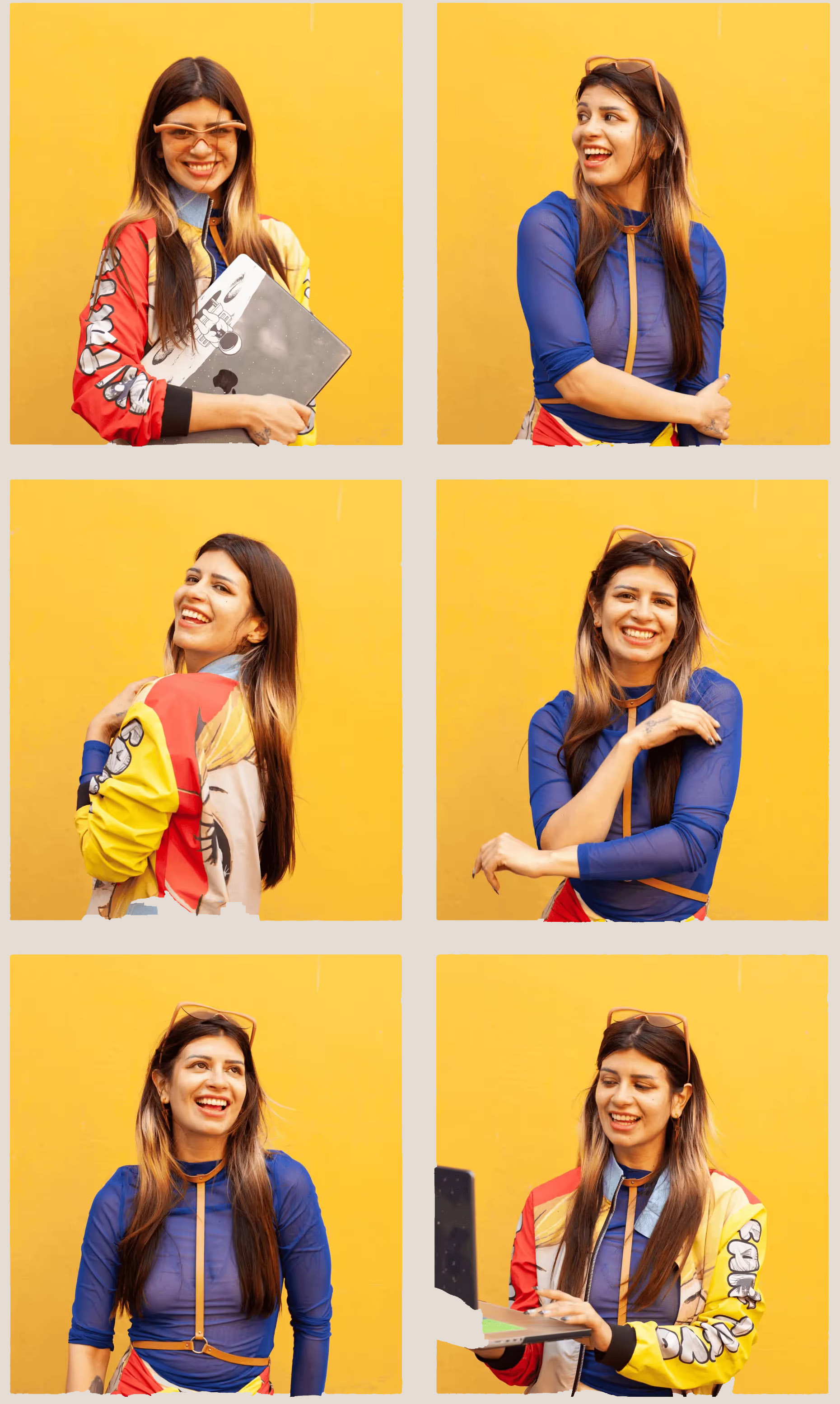 inside .contact-aside-photo
─────────────────────────────────────────────────────
*/
.contact-aside-photo img { width: 100%; height: 100%; object-fit: cover; }
.contact-aside-photo__placeholder {
display: flex; flex-direction: column; align-items: center; gap: 10px;
color: var(--ink-mid); font-size: 10.5px; letter-spacing: 0.07em;
text-transform: uppercase; text-align: center;
}
.contact-aside-photo__placeholder svg { opacity: 0.3; }
.contact-aside-links { display: flex; flex-direction: column; gap: 12px; }
.contact-aside-links a {
font-size: 14px; font-weight: 400; color: var(--accent);
text-decoration: none; display: flex; align-items: center; gap: 8px;
opacity: 0.8; transition: opacity 200ms var(--ease-calm);
}
.contact-aside-links a:hover { opacity: 1; }
.contact-aside-links a svg { flex-shrink: 0; opacity: 0.7; }
/* ── REVEAL ───────────────────────────────────────────────── */
[data-reveal] {
opacity: 0; transform: translateY(10px);
transition: opacity 700ms var(--ease-out), transform 700ms var(--ease-out);
}
[data-reveal].is-visible { opacity: 1; transform: translateY(0); }
/* Fixed scroll hint inside hero__inner sticky layer */
.scroll-hint {
position: fixed;
bottom: 48px;
left: 80px;
display: flex;
flex-direction: column;
align-items: flex-start;
gap: 8px;
opacity: 0;
animation: fade-up 700ms var(--ease-out) 2200ms forwards;
transition: opacity 500ms var(--ease-calm);
pointer-events: none;
z-index: 10;
}
.scroll-hint.is-hidden {
opacity: 0 !important;
transition: opacity 500ms var(--ease-calm);
}
.scroll-hint__label {
font-size: 9.5px;
letter-spacing: 0.14em;
text-transform: uppercase;
font-weight: 700;
color: var(--accent);
opacity: 0.75;
}
.scroll-hint__track {
width: 2px;
height: 44px;
background: var(--periwinkle);
border-radius: 999px;
position: relative;
overflow: hidden;
}
.scroll-hint__track::after {
content: '';
position: absolute;
top: 0; left: 0;
width: 100%;
height: 45%;
background: var(--accent);
border-radius: 999px;
animation: scroll-drop 1500ms var(--ease-out) 2400ms infinite;
}
@keyframes scroll-drop {
0% { transform: translateY(-100%); opacity: 0; }
15% { opacity: 1; }
85% { opacity: 1; }
100% { transform: translateY(230%); opacity: 0; }
}
/* Mobile: move to bottom-right so it never collides with the
left-aligned hero copy. align-items flips so the dot/track
sit on the right edge, not the left. */
@media (max-width: 900px) {
.scroll-hint {
bottom: 90px;
left: auto;
right: 24px;
align-items: flex-end;
}
}
/* Short viewports — small laptops, landscape phones, mobile
with the address bar showing — the hero copy fills almost
the full height. Hide the hint rather than let it sit on
top of the subtitle. */
@media (max-height: 700px) {
.scroll-hint { display: none; }
}
/* Inline variant removed */
/* ── RAIL REFINEMENT ──────────────────────────────────────── */
/* Hover: label slides in with soft dot accent, no opacity bleed */
.rail__item { cursor: pointer; }
.rail__item:hover .rail__label {
opacity: 0.55;
transform: translateX(0);
color: var(--ink-mid);
}
.rail__item:hover .rail__seg {
background: rgba(75,61,143,0.35);
height: 22px;
}
[data-theme="dark"] .rail__item:hover .rail__seg {
background: rgba(184,197,235,0.35);
}
/* Active state stays crisp */
.rail__item[data-active] .rail__seg {
width: 3px; height: 32px;
background: var(--accent);
box-shadow: 0 0 8px rgba(75,61,143,0.25);
}
.rail__item[data-active] .rail__label {
opacity: 1;
color: var(--accent);
font-weight: 700;
}
/* ── RAIL THEME TOGGLE ────────────────────────────────────── */
.rail__divider {
width: 20px;
height: 1px;
background: var(--rule);
margin: 6px 0 6px 0;
border-radius: 999px;
}
.rail__theme {
background: none;
border: 1.5px solid var(--rule);
border-radius: 50%;
width: 28px; height: 28px;
cursor: pointer;
color: var(--ink-mid);
display: flex;
align-items: center;
justify-content: center;
transition:
color 200ms var(--ease-calm),
border-color 200ms var(--ease-calm),
background 200ms var(--ease-calm),
box-shadow 240ms var(--ease-calm),
transform 320ms var(--ease-out);
padding: 0;
}
.rail__theme:hover {
color: var(--accent);
border-color: var(--accent);
background: var(--accent-light);
/* Soft colored corner glow for fun */
box-shadow: 0 0 0 4px var(--accent-light), 0 6px 22px var(--accent-light);
transform: rotate(-12deg) scale(1.06);
}
.rail__theme-icon { display: block; transition: transform 360ms var(--ease-out); }
.rail__theme:hover .rail__theme-icon {
transform: rotate(12deg) scale(1.05);
}
.icon-sun { display: none; }
.icon-moon { display: block; }
[data-theme="dark"] .icon-sun { display: block; }
[data-theme="dark"] .icon-moon { display: none; }
/* ── WORK-PAGE DARK MODE OVERRIDES ───────────────────────── */
/* Astro strips [data-theme] from scoped styles — put those here */
[data-theme="dark"] .hero-kicker { color: var(--accent); }
/* ── WORK-PAGE LEFT NAV (theme toggle below back button) ──── */
.work-nav {
position: fixed;
top: 72px; /* sits just below .back at top: 36px */
left: 40px;
z-index: 200;
display: flex;
flex-direction: column;
align-items: flex-start;
gap: 10px;
}
/* Hide on main index page — rail already has the toggle */
body:has(.rail) .work-nav { display: none; }
/* On mobile the .work-bottom-nav (solid bg) takes over so the
transparent floating toggle doesn't sit weirdly over content. */
@media (max-width: 900px) { .work-nav { display: none; } }
.work-nav__divider {
width: 20px;
height: 1px;
background: var(--rule);
border-radius: 999px;
}
.work-nav__theme {
background: none;
border: 1.5px solid var(--rule);
border-radius: 50%;
width: 28px; height: 28px;
display: flex;
align-items: center;
justify-content: center;
color: var(--ink-mid);
cursor: pointer;
transition:
color 200ms var(--ease-calm),
border-color 200ms var(--ease-calm),
background 200ms var(--ease-calm),
box-shadow 240ms var(--ease-calm),
transform 320ms var(--ease-out);
padding: 0;
position: relative;
}
.work-nav__theme:hover {
color: var(--accent);
border-color: var(--accent);
background: var(--accent-light);
/* Soft colored glow in the corner — fun accent on hover */
box-shadow: 0 0 0 4px var(--accent-light), 0 6px 22px var(--accent-light);
transform: rotate(-12deg) scale(1.06);
}
.work-nav__theme svg {
transition: transform 360ms var(--ease-out);
}
.work-nav__theme:hover svg {
transform: rotate(12deg) scale(1.05); /* counter-rotate so icon stays upright-ish */
}
/* ── MOBILE BOTTOM NAV — work pages + CV ───────────────────
Solid background just like the index .bottom-nav so the
theme toggle and back link don't float transparent over
content on phones. Hidden on desktop (rail/work-nav handle
it) and on the index (its own .bottom-nav covers it). */
.work-bottom-nav {
display: none;
position: fixed;
bottom: 0; left: 0; right: 0;
z-index: 100;
background: var(--bg-nav);
backdrop-filter: blur(14px);
-webkit-backdrop-filter: blur(14px);
border-top: 1px solid var(--rule);
padding: 10px 16px calc(env(safe-area-inset-bottom, 0px) + 10px);
flex-direction: row;
justify-content: space-between;
align-items: center;
gap: 12px;
}
/* Hide on the index — its own .bottom-nav already exists */
body:has(.rail) .work-bottom-nav { display: none !important; }
/* Show only on mobile and only when there's no rail */
@media (max-width: 900px) {
.work-bottom-nav { display: flex; }
/* Push content up so it isn't covered by the bar */
body:not(:has(.rail)) { padding-bottom: 70px; }
}
.work-bottom-nav__item {
display: inline-flex;
align-items: center;
gap: 8px;
text-decoration: none;
color: var(--ink);
font-size: 11px;
letter-spacing: 0.11em;
text-transform: uppercase;
font-weight: 600;
padding: 6px 10px;
border-radius: 999px;
transition: color 220ms var(--ease-calm), background 220ms var(--ease-calm);
}
.work-bottom-nav__item:hover {
color: var(--accent);
background: var(--accent-light);
}
.work-bottom-nav__icon {
display: inline-flex;
align-items: center;
justify-content: center;
color: currentColor;
transition: transform 240ms var(--ease-out);
}
.work-bottom-nav__item:hover .work-bottom-nav__icon {
transform: translateX(-3px);
}
.work-bottom-nav__divider {
width: 1px;
height: 22px;
background: var(--rule);
border-radius: 999px;
flex-shrink: 0;
}
.work-bottom-nav__theme {
background: none;
border: 1.5px solid var(--rule);
border-radius: 50%;
width: 32px; height: 32px;
display: flex;
align-items: center;
justify-content: center;
color: var(--ink-mid);
cursor: pointer;
padding: 0;
flex-shrink: 0;
transition:
color 200ms var(--ease-calm),
border-color 200ms var(--ease-calm),
background 200ms var(--ease-calm),
box-shadow 240ms var(--ease-calm),
transform 320ms var(--ease-out);
}
.work-bottom-nav__theme:hover {
color: var(--accent);
border-color: var(--accent);
background: var(--accent-light);
box-shadow: 0 0 0 4px var(--accent-light);
transform: rotate(-12deg) scale(1.06);
}
.work-bottom-nav__theme svg {
transition: transform 360ms var(--ease-out);
}
.work-bottom-nav__theme:hover svg {
transform: rotate(12deg) scale(1.05);
}
/* ── CUSTOM CURSOR ────────────────────────────────────────── */
* { cursor: none !important; }
.cursor {
position: fixed;
top: 0; left: 0;
pointer-events: none;
z-index: 99999;
transform: translate(-50%, -50%);
will-change: transform;
opacity: 0;
transition: opacity 300ms var(--ease-calm);
}
.cursor.is-visible { opacity: 1; }
.cursor__dot {
width: 10px; height: 10px;
border-radius: 50%;
background: var(--cursor-color);
box-shadow:
0 0 0 0 var(--cursor-color),
0 0 18px 7px var(--cursor-glow);
transition:
width 220ms var(--ease-out),
height 220ms var(--ease-out),
background 220ms var(--ease-out),
box-shadow 220ms var(--ease-out);
}
/* Hovering a link/button: dot expands into a ring with a stronger glow.
Sized so it doesn't fully cover small inline icons (16-22px arrows). */
.cursor.is-hovered .cursor__dot {
width: 22px; height: 22px;
background: transparent;
box-shadow:
inset 0 0 0 1.5px var(--cursor-color),
0 0 24px 10px var(--cursor-glow);
}
@media (hover: none) { .cursor { display: none; } * { cursor: auto !important; } }
/* ── BOTTOM NAV (mobile) ──────────────────────────────────── */
.bottom-nav {
display: none;
position: fixed;
bottom: 0; left: 0; right: 0;
z-index: 100;
background: var(--bg-nav);
backdrop-filter: blur(14px);
-webkit-backdrop-filter: blur(14px);
border-top: 1px solid var(--rule);
padding: 10px 4px calc(env(safe-area-inset-bottom, 0px) + 8px);
flex-direction: row;
justify-content: space-around;
align-items: center;
gap: 2px;
}
@media (max-width: 900px) { .bottom-nav { display: flex; } }
/* Nav link items — same visual language as desktop rail */
.bottom-nav__item {
display: flex;
flex-direction: column;
align-items: center;
gap: 6px;
text-decoration: none;
color: var(--ink-mid);
padding: 4px 8px;
transition: color 260ms var(--ease-calm);
}
.bottom-nav__item[data-active] { color: var(--accent); }
/* Horizontal segment — mirrors the vertical rail__seg */
.bottom-nav__seg {
width: 18px; height: 2px;
border-radius: 999px;
background: var(--rail-seg);
transition: width 260ms var(--ease-calm), height 260ms var(--ease-calm), background 260ms var(--ease-calm);
flex-shrink: 0;
}
.bottom-nav__item[data-active] .bottom-nav__seg {
width: 28px;
height: 3px;
background: var(--accent);
box-shadow: 0 0 8px rgba(75,61,143,0.25);
}
[data-theme="dark"] .bottom-nav__item[data-active] .bottom-nav__seg {
box-shadow: 0 0 8px rgba(184,197,235,0.25);
}
/* Label — same font spec as rail__label */
.bottom-nav__label {
font-size: 10px;
letter-spacing: 0.10em;
text-transform: uppercase;
font-weight: 600;
line-height: 1;
transition: color 260ms var(--ease-calm), font-weight 260ms var(--ease-calm);
}
.bottom-nav__item[data-active] .bottom-nav__label {
color: var(--accent);
font-weight: 700;
}
/* Divider before theme toggle */
.bottom-nav__divider {
width: 1px;
height: 22px;
background: var(--rule);
border-radius: 999px;
flex-shrink: 0;
margin: 0 2px;
}
/* Theme toggle button in bottom nav — matches the work-page style
(bordered circle + corner glow + icon spin) so the control reads
the same across desktop rail, work pages, and mobile. */
.bottom-nav__theme {
background: none;
border: 1.5px solid var(--rule);
border-radius: 50%;
width: 32px; height: 32px;
padding: 0;
cursor: none;
color: var(--ink-mid);
display: flex;
align-items: center;
justify-content: center;
flex-shrink: 0;
transition:
color 200ms var(--ease-calm),
border-color 200ms var(--ease-calm),
background 200ms var(--ease-calm),
box-shadow 240ms var(--ease-calm),
transform 320ms var(--ease-out);
}
.bottom-nav__theme:hover {
color: var(--accent);
border-color: var(--accent);
background: var(--accent-light);
box-shadow: 0 0 0 4px var(--accent-light);
transform: rotate(-12deg) scale(1.06);
}
.bottom-nav__theme svg {
transition: transform 360ms var(--ease-out);
}
.bottom-nav__theme:hover svg {
transform: rotate(12deg) scale(1.05);
}
/* Push content up so it's not hidden behind bottom nav on mobile */
@media (max-width: 900px) {
body { padding-bottom: 70px; }
}
/* ── REDUCED MOTION ───────────────────────────────────────── */
@media (prefers-reduced-motion: reduce) {
*, *::before, *::after { animation: none !important; transition: none !important; }
.typewriter { width: 100% !important; }
.block-reveal::after { transform: scaleX(0) !important; }
.hero__sub, [data-reveal], .trusted-item, .project-card,
.section-label, .gallery-item { opacity: 1 !important; transform: none !important; }
.ti-draw { stroke-dashoffset: 0 !important; }
.marquee-track { animation: none !important; }
.scroll-hint { opacity: 1 !important; }
.scroll-hint__track::after { animation: none !important; }
}
inside .contact-aside-photo
─────────────────────────────────────────────────────
*/
.contact-aside-photo img { width: 100%; height: 100%; object-fit: cover; }
.contact-aside-photo__placeholder {
display: flex; flex-direction: column; align-items: center; gap: 10px;
color: var(--ink-mid); font-size: 10.5px; letter-spacing: 0.07em;
text-transform: uppercase; text-align: center;
}
.contact-aside-photo__placeholder svg { opacity: 0.3; }
.contact-aside-links { display: flex; flex-direction: column; gap: 12px; }
.contact-aside-links a {
font-size: 14px; font-weight: 400; color: var(--accent);
text-decoration: none; display: flex; align-items: center; gap: 8px;
opacity: 0.8; transition: opacity 200ms var(--ease-calm);
}
.contact-aside-links a:hover { opacity: 1; }
.contact-aside-links a svg { flex-shrink: 0; opacity: 0.7; }
/* ── REVEAL ───────────────────────────────────────────────── */
[data-reveal] {
opacity: 0; transform: translateY(10px);
transition: opacity 700ms var(--ease-out), transform 700ms var(--ease-out);
}
[data-reveal].is-visible { opacity: 1; transform: translateY(0); }
/* Fixed scroll hint inside hero__inner sticky layer */
.scroll-hint {
position: fixed;
bottom: 48px;
left: 80px;
display: flex;
flex-direction: column;
align-items: flex-start;
gap: 8px;
opacity: 0;
animation: fade-up 700ms var(--ease-out) 2200ms forwards;
transition: opacity 500ms var(--ease-calm);
pointer-events: none;
z-index: 10;
}
.scroll-hint.is-hidden {
opacity: 0 !important;
transition: opacity 500ms var(--ease-calm);
}
.scroll-hint__label {
font-size: 9.5px;
letter-spacing: 0.14em;
text-transform: uppercase;
font-weight: 700;
color: var(--accent);
opacity: 0.75;
}
.scroll-hint__track {
width: 2px;
height: 44px;
background: var(--periwinkle);
border-radius: 999px;
position: relative;
overflow: hidden;
}
.scroll-hint__track::after {
content: '';
position: absolute;
top: 0; left: 0;
width: 100%;
height: 45%;
background: var(--accent);
border-radius: 999px;
animation: scroll-drop 1500ms var(--ease-out) 2400ms infinite;
}
@keyframes scroll-drop {
0% { transform: translateY(-100%); opacity: 0; }
15% { opacity: 1; }
85% { opacity: 1; }
100% { transform: translateY(230%); opacity: 0; }
}
/* Mobile: move to bottom-right so it never collides with the
left-aligned hero copy. align-items flips so the dot/track
sit on the right edge, not the left. */
@media (max-width: 900px) {
.scroll-hint {
bottom: 90px;
left: auto;
right: 24px;
align-items: flex-end;
}
}
/* Short viewports — small laptops, landscape phones, mobile
with the address bar showing — the hero copy fills almost
the full height. Hide the hint rather than let it sit on
top of the subtitle. */
@media (max-height: 700px) {
.scroll-hint { display: none; }
}
/* Inline variant removed */
/* ── RAIL REFINEMENT ──────────────────────────────────────── */
/* Hover: label slides in with soft dot accent, no opacity bleed */
.rail__item { cursor: pointer; }
.rail__item:hover .rail__label {
opacity: 0.55;
transform: translateX(0);
color: var(--ink-mid);
}
.rail__item:hover .rail__seg {
background: rgba(75,61,143,0.35);
height: 22px;
}
[data-theme="dark"] .rail__item:hover .rail__seg {
background: rgba(184,197,235,0.35);
}
/* Active state stays crisp */
.rail__item[data-active] .rail__seg {
width: 3px; height: 32px;
background: var(--accent);
box-shadow: 0 0 8px rgba(75,61,143,0.25);
}
.rail__item[data-active] .rail__label {
opacity: 1;
color: var(--accent);
font-weight: 700;
}
/* ── RAIL THEME TOGGLE ────────────────────────────────────── */
.rail__divider {
width: 20px;
height: 1px;
background: var(--rule);
margin: 6px 0 6px 0;
border-radius: 999px;
}
.rail__theme {
background: none;
border: 1.5px solid var(--rule);
border-radius: 50%;
width: 28px; height: 28px;
cursor: pointer;
color: var(--ink-mid);
display: flex;
align-items: center;
justify-content: center;
transition:
color 200ms var(--ease-calm),
border-color 200ms var(--ease-calm),
background 200ms var(--ease-calm),
box-shadow 240ms var(--ease-calm),
transform 320ms var(--ease-out);
padding: 0;
}
.rail__theme:hover {
color: var(--accent);
border-color: var(--accent);
background: var(--accent-light);
/* Soft colored corner glow for fun */
box-shadow: 0 0 0 4px var(--accent-light), 0 6px 22px var(--accent-light);
transform: rotate(-12deg) scale(1.06);
}
.rail__theme-icon { display: block; transition: transform 360ms var(--ease-out); }
.rail__theme:hover .rail__theme-icon {
transform: rotate(12deg) scale(1.05);
}
.icon-sun { display: none; }
.icon-moon { display: block; }
[data-theme="dark"] .icon-sun { display: block; }
[data-theme="dark"] .icon-moon { display: none; }
/* ── WORK-PAGE DARK MODE OVERRIDES ───────────────────────── */
/* Astro strips [data-theme] from scoped styles — put those here */
[data-theme="dark"] .hero-kicker { color: var(--accent); }
/* ── WORK-PAGE LEFT NAV (theme toggle below back button) ──── */
.work-nav {
position: fixed;
top: 72px; /* sits just below .back at top: 36px */
left: 40px;
z-index: 200;
display: flex;
flex-direction: column;
align-items: flex-start;
gap: 10px;
}
/* Hide on main index page — rail already has the toggle */
body:has(.rail) .work-nav { display: none; }
/* On mobile the .work-bottom-nav (solid bg) takes over so the
transparent floating toggle doesn't sit weirdly over content. */
@media (max-width: 900px) { .work-nav { display: none; } }
.work-nav__divider {
width: 20px;
height: 1px;
background: var(--rule);
border-radius: 999px;
}
.work-nav__theme {
background: none;
border: 1.5px solid var(--rule);
border-radius: 50%;
width: 28px; height: 28px;
display: flex;
align-items: center;
justify-content: center;
color: var(--ink-mid);
cursor: pointer;
transition:
color 200ms var(--ease-calm),
border-color 200ms var(--ease-calm),
background 200ms var(--ease-calm),
box-shadow 240ms var(--ease-calm),
transform 320ms var(--ease-out);
padding: 0;
position: relative;
}
.work-nav__theme:hover {
color: var(--accent);
border-color: var(--accent);
background: var(--accent-light);
/* Soft colored glow in the corner — fun accent on hover */
box-shadow: 0 0 0 4px var(--accent-light), 0 6px 22px var(--accent-light);
transform: rotate(-12deg) scale(1.06);
}
.work-nav__theme svg {
transition: transform 360ms var(--ease-out);
}
.work-nav__theme:hover svg {
transform: rotate(12deg) scale(1.05); /* counter-rotate so icon stays upright-ish */
}
/* ── MOBILE BOTTOM NAV — work pages + CV ───────────────────
Solid background just like the index .bottom-nav so the
theme toggle and back link don't float transparent over
content on phones. Hidden on desktop (rail/work-nav handle
it) and on the index (its own .bottom-nav covers it). */
.work-bottom-nav {
display: none;
position: fixed;
bottom: 0; left: 0; right: 0;
z-index: 100;
background: var(--bg-nav);
backdrop-filter: blur(14px);
-webkit-backdrop-filter: blur(14px);
border-top: 1px solid var(--rule);
padding: 10px 16px calc(env(safe-area-inset-bottom, 0px) + 10px);
flex-direction: row;
justify-content: space-between;
align-items: center;
gap: 12px;
}
/* Hide on the index — its own .bottom-nav already exists */
body:has(.rail) .work-bottom-nav { display: none !important; }
/* Show only on mobile and only when there's no rail */
@media (max-width: 900px) {
.work-bottom-nav { display: flex; }
/* Push content up so it isn't covered by the bar */
body:not(:has(.rail)) { padding-bottom: 70px; }
}
.work-bottom-nav__item {
display: inline-flex;
align-items: center;
gap: 8px;
text-decoration: none;
color: var(--ink);
font-size: 11px;
letter-spacing: 0.11em;
text-transform: uppercase;
font-weight: 600;
padding: 6px 10px;
border-radius: 999px;
transition: color 220ms var(--ease-calm), background 220ms var(--ease-calm);
}
.work-bottom-nav__item:hover {
color: var(--accent);
background: var(--accent-light);
}
.work-bottom-nav__icon {
display: inline-flex;
align-items: center;
justify-content: center;
color: currentColor;
transition: transform 240ms var(--ease-out);
}
.work-bottom-nav__item:hover .work-bottom-nav__icon {
transform: translateX(-3px);
}
.work-bottom-nav__divider {
width: 1px;
height: 22px;
background: var(--rule);
border-radius: 999px;
flex-shrink: 0;
}
.work-bottom-nav__theme {
background: none;
border: 1.5px solid var(--rule);
border-radius: 50%;
width: 32px; height: 32px;
display: flex;
align-items: center;
justify-content: center;
color: var(--ink-mid);
cursor: pointer;
padding: 0;
flex-shrink: 0;
transition:
color 200ms var(--ease-calm),
border-color 200ms var(--ease-calm),
background 200ms var(--ease-calm),
box-shadow 240ms var(--ease-calm),
transform 320ms var(--ease-out);
}
.work-bottom-nav__theme:hover {
color: var(--accent);
border-color: var(--accent);
background: var(--accent-light);
box-shadow: 0 0 0 4px var(--accent-light);
transform: rotate(-12deg) scale(1.06);
}
.work-bottom-nav__theme svg {
transition: transform 360ms var(--ease-out);
}
.work-bottom-nav__theme:hover svg {
transform: rotate(12deg) scale(1.05);
}
/* ── CUSTOM CURSOR ────────────────────────────────────────── */
* { cursor: none !important; }
.cursor {
position: fixed;
top: 0; left: 0;
pointer-events: none;
z-index: 99999;
transform: translate(-50%, -50%);
will-change: transform;
opacity: 0;
transition: opacity 300ms var(--ease-calm);
}
.cursor.is-visible { opacity: 1; }
.cursor__dot {
width: 10px; height: 10px;
border-radius: 50%;
background: var(--cursor-color);
box-shadow:
0 0 0 0 var(--cursor-color),
0 0 18px 7px var(--cursor-glow);
transition:
width 220ms var(--ease-out),
height 220ms var(--ease-out),
background 220ms var(--ease-out),
box-shadow 220ms var(--ease-out);
}
/* Hovering a link/button: dot expands into a ring with a stronger glow.
Sized so it doesn't fully cover small inline icons (16-22px arrows). */
.cursor.is-hovered .cursor__dot {
width: 22px; height: 22px;
background: transparent;
box-shadow:
inset 0 0 0 1.5px var(--cursor-color),
0 0 24px 10px var(--cursor-glow);
}
@media (hover: none) { .cursor { display: none; } * { cursor: auto !important; } }
/* ── BOTTOM NAV (mobile) ──────────────────────────────────── */
.bottom-nav {
display: none;
position: fixed;
bottom: 0; left: 0; right: 0;
z-index: 100;
background: var(--bg-nav);
backdrop-filter: blur(14px);
-webkit-backdrop-filter: blur(14px);
border-top: 1px solid var(--rule);
padding: 10px 4px calc(env(safe-area-inset-bottom, 0px) + 8px);
flex-direction: row;
justify-content: space-around;
align-items: center;
gap: 2px;
}
@media (max-width: 900px) { .bottom-nav { display: flex; } }
/* Nav link items — same visual language as desktop rail */
.bottom-nav__item {
display: flex;
flex-direction: column;
align-items: center;
gap: 6px;
text-decoration: none;
color: var(--ink-mid);
padding: 4px 8px;
transition: color 260ms var(--ease-calm);
}
.bottom-nav__item[data-active] { color: var(--accent); }
/* Horizontal segment — mirrors the vertical rail__seg */
.bottom-nav__seg {
width: 18px; height: 2px;
border-radius: 999px;
background: var(--rail-seg);
transition: width 260ms var(--ease-calm), height 260ms var(--ease-calm), background 260ms var(--ease-calm);
flex-shrink: 0;
}
.bottom-nav__item[data-active] .bottom-nav__seg {
width: 28px;
height: 3px;
background: var(--accent);
box-shadow: 0 0 8px rgba(75,61,143,0.25);
}
[data-theme="dark"] .bottom-nav__item[data-active] .bottom-nav__seg {
box-shadow: 0 0 8px rgba(184,197,235,0.25);
}
/* Label — same font spec as rail__label */
.bottom-nav__label {
font-size: 10px;
letter-spacing: 0.10em;
text-transform: uppercase;
font-weight: 600;
line-height: 1;
transition: color 260ms var(--ease-calm), font-weight 260ms var(--ease-calm);
}
.bottom-nav__item[data-active] .bottom-nav__label {
color: var(--accent);
font-weight: 700;
}
/* Divider before theme toggle */
.bottom-nav__divider {
width: 1px;
height: 22px;
background: var(--rule);
border-radius: 999px;
flex-shrink: 0;
margin: 0 2px;
}
/* Theme toggle button in bottom nav — matches the work-page style
(bordered circle + corner glow + icon spin) so the control reads
the same across desktop rail, work pages, and mobile. */
.bottom-nav__theme {
background: none;
border: 1.5px solid var(--rule);
border-radius: 50%;
width: 32px; height: 32px;
padding: 0;
cursor: none;
color: var(--ink-mid);
display: flex;
align-items: center;
justify-content: center;
flex-shrink: 0;
transition:
color 200ms var(--ease-calm),
border-color 200ms var(--ease-calm),
background 200ms var(--ease-calm),
box-shadow 240ms var(--ease-calm),
transform 320ms var(--ease-out);
}
.bottom-nav__theme:hover {
color: var(--accent);
border-color: var(--accent);
background: var(--accent-light);
box-shadow: 0 0 0 4px var(--accent-light);
transform: rotate(-12deg) scale(1.06);
}
.bottom-nav__theme svg {
transition: transform 360ms var(--ease-out);
}
.bottom-nav__theme:hover svg {
transform: rotate(12deg) scale(1.05);
}
/* Push content up so it's not hidden behind bottom nav on mobile */
@media (max-width: 900px) {
body { padding-bottom: 70px; }
}
/* ── REDUCED MOTION ───────────────────────────────────────── */
@media (prefers-reduced-motion: reduce) {
*, *::before, *::after { animation: none !important; transition: none !important; }
.typewriter { width: 100% !important; }
.block-reveal::after { transform: scaleX(0) !important; }
.hero__sub, [data-reveal], .trusted-item, .project-card,
.section-label, .gallery-item { opacity: 1 !important; transform: none !important; }
.ti-draw { stroke-dashoffset: 0 !important; }
.marquee-track { animation: none !important; }
.scroll-hint { opacity: 1 !important; }
.scroll-hint__track::after { animation: none !important; }
}