Health Management System · Praxent · 2021
Four products. One language.
"To understand enough about a project like this to be an effective designer is a challenge. To do it in two weeks is almost impossible." Nick Comito
The brief
Four enterprise health management products had evolved independently over time. Different interfaces. Different interaction patterns. Different visual systems. Users moved between them daily.
The goal wasn’t to redesign everything. It was to unify them — without disrupting active workflows or rebuilding from scratch. That constraint shaped the entire approach.
Style guide as infrastructure
The first deliverable wasn’t a screen. It was infrastructure. A shared system of tokens, components, interaction rules, and layout patterns that could be adopted incrementally across all four products. The goal wasn’t visual alignment. It was behavioral consistency.
Once the system existed, new features stopped introducing divergence. Teams had a reference point. Unexpectedly, it also changed onboarding. Before the guide, it took nearly three months for a designer to become effective on the product. Afterward, it took five days. The system didn’t just unify the UI. It compressed tribal knowledge into something scalable.
The style guide didn't just align the UI — it compressed three months of tribal knowledge into a document any designer could read in a day. That's the kind of impact that doesn't show up in a Figma screenshot.
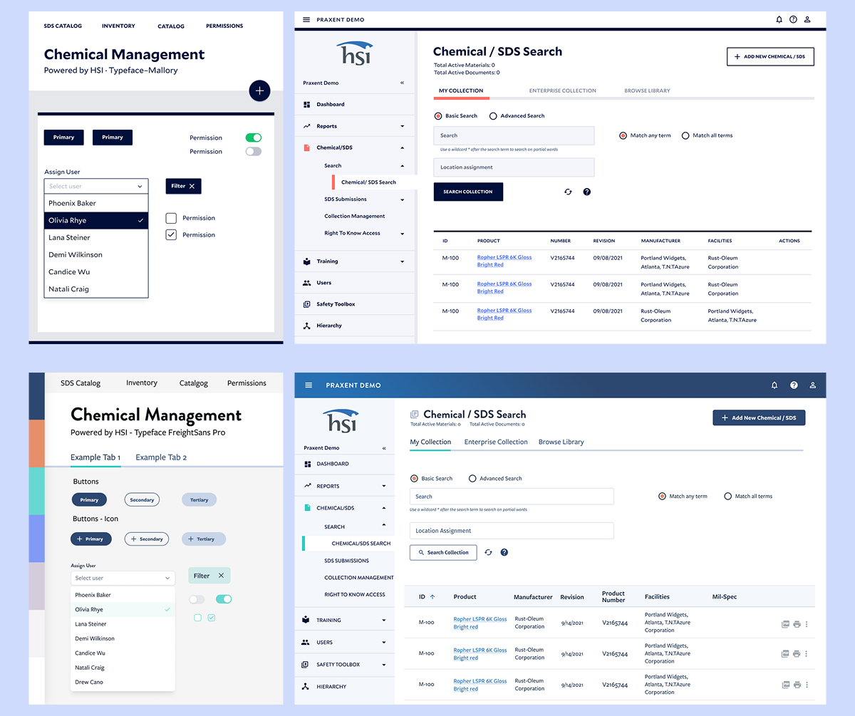
Design process — two proposals explored for the unified direction, mapped against the existing product structure.
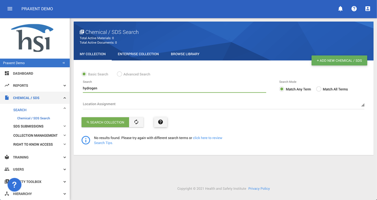
Before — the original product UI, prior to the style guide and UI unification work.
The hardest screen in the system
Every enterprise product has that one area — the one that takes weeks to understand and months to redesign without breaking. Here it was the injury case management view: nested navigation, sub-navigation within sub-navigation, complex data tables with inline actions, filtering, and a layout that had to work on desktop, tablet, and mobile.
I took ownership of the most complex surface in the system. — and the area the manager specifically mentioned in their review. The challenge wasn't just visual: it was restructuring how information hierarchy worked across three breakpoints, without disrupting the mental model users had built up over years of use.
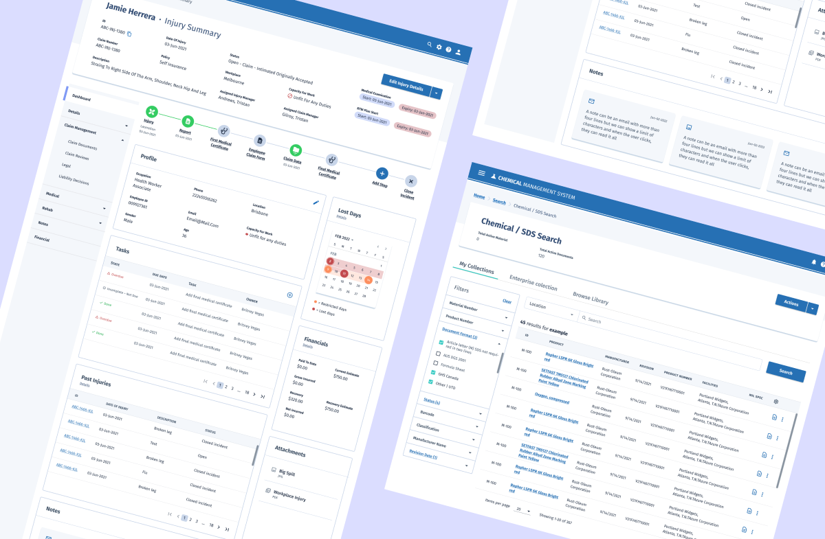
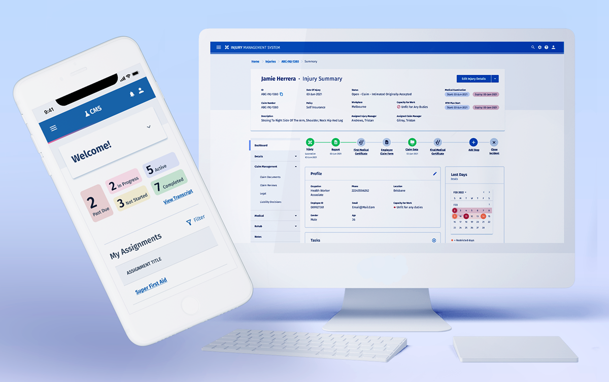
The injury case management view — nested navigation, profile data, task tables, financial summary, and a lost-days calendar all in a single scrollable layout.
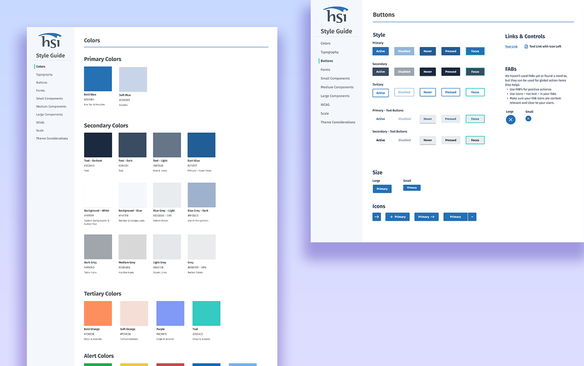
The unified design system — component library, color tokens, and patterns that gave the four products a shared visual language.
What the team said
This is what my manager at Praxent wrote after the project — unprompted, in a LinkedIn recommendation. I include it here not as a credential but as a description of what this kind of work actually requires.
"Cami was on my team which is responsible for delivering highly competitive product design solutions to financial services clients in lending, wealth management, banking, and insurance. For one project in particular, we were tasked with unifying four products into one by creating a style guide with an entirely new UI, while also restructuring the layout and interactions of several key areas of the product suite. On top of that our stakeholders were in four different parts of the world, and aligning schedules were difficult. To be able to understand enough about a project like this to be an effective designer is a challenge. To be able to do it in two weeks — the time we had to onboard — is almost impossible. Cami did great."