Media · Corporate Web · Design System · 2023
Rebuilding a flagship as a system.
The brief
Paramount.com is the company’s flagship. A single entry point for investors, advertisers, talent, media, and employees. Each audience arrives with a different question.
After years of reorganizations, the structure no longer reflected the new brand. Pages were orphaned. Components diverged. Navigation paths overlapped. The experience felt assembled, not designed. Beyond was brought in to rearchitect and redesign the platform around a clearer system around their new branding work.
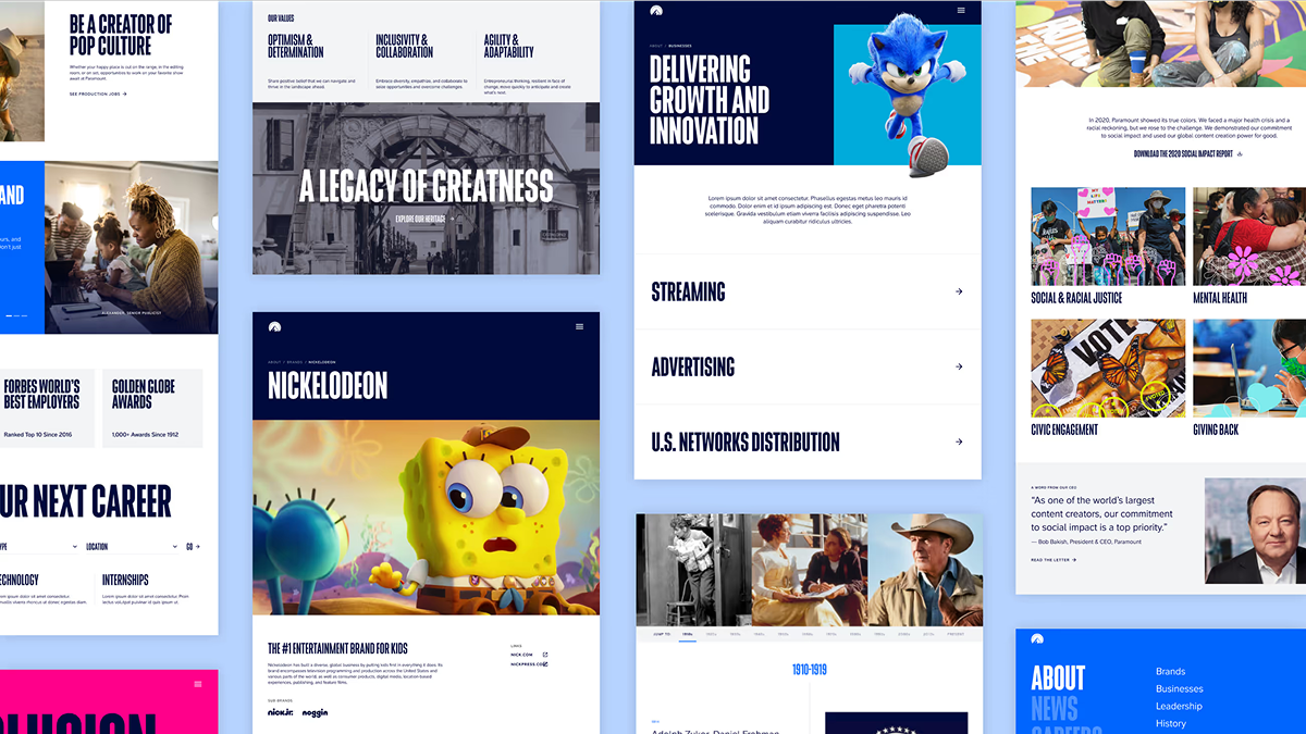
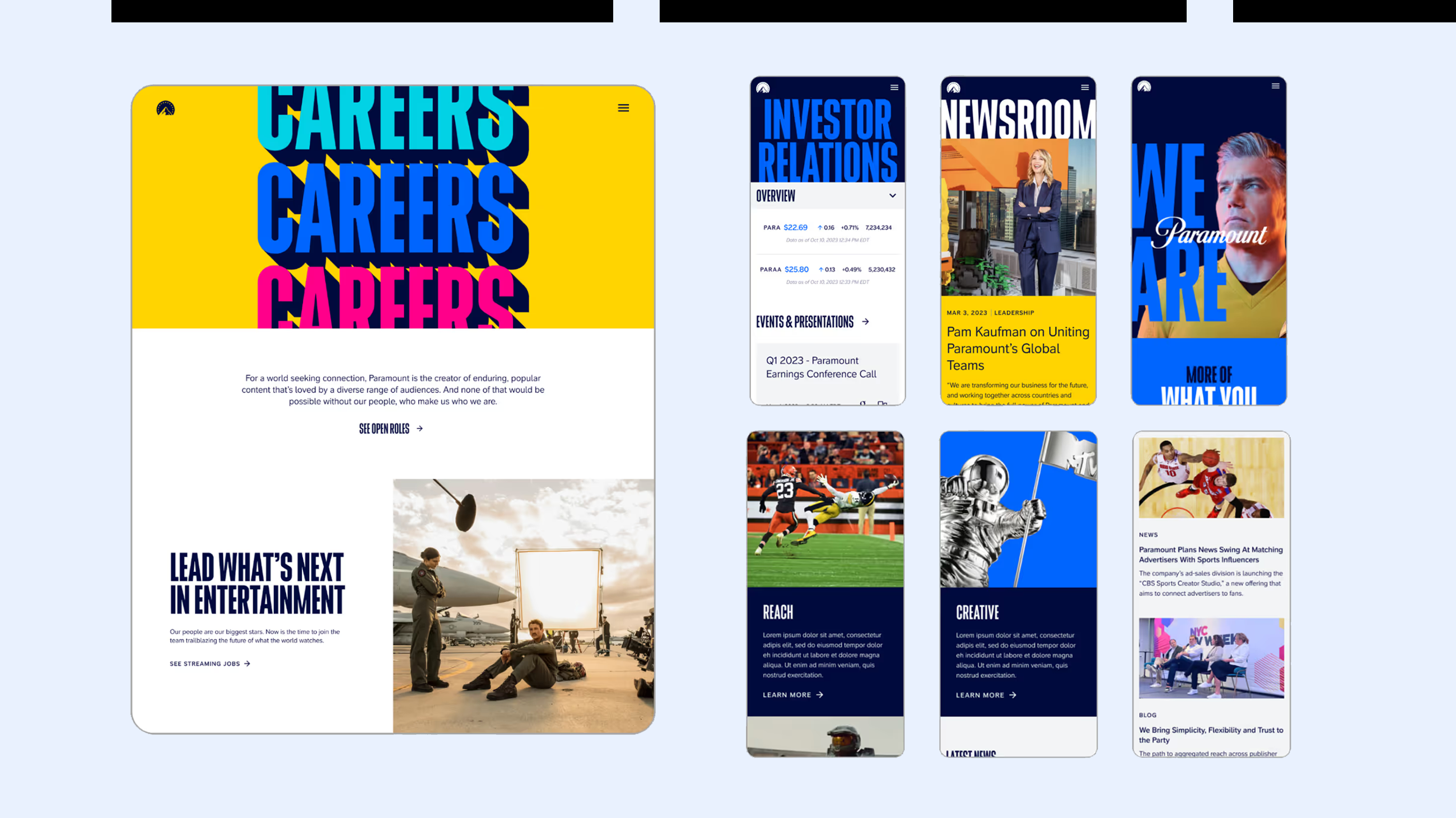
Key pages across the redesign — newsroom, investor relations, DEI, careers, and brand landing pages.
The challenge
This wasn’t a visual refresh. It was the first large-scale implementation of Paramount’s newly released brand identity. The guidelines were clear at the surface level — color, typography, tone. But untested at web scale. The system had to stretch.
From investor relations to entertainment properties, the same design language had to support authority and playfulness without fragmenting. The brand needed range. The experience needed coherence.
Finding the structure
We started with interviews, audits, and competitive benchmarking — not to gather inspiration, but to identify structural gaps. The audit revealed three problems:
– navigation built around internal teams instead of audiences
– no scalable framework for brand expression
From there, the direction became clear: simplify the architecture, define modular templates, and create a system that could flex across five audience contexts without breaking visual continuity.
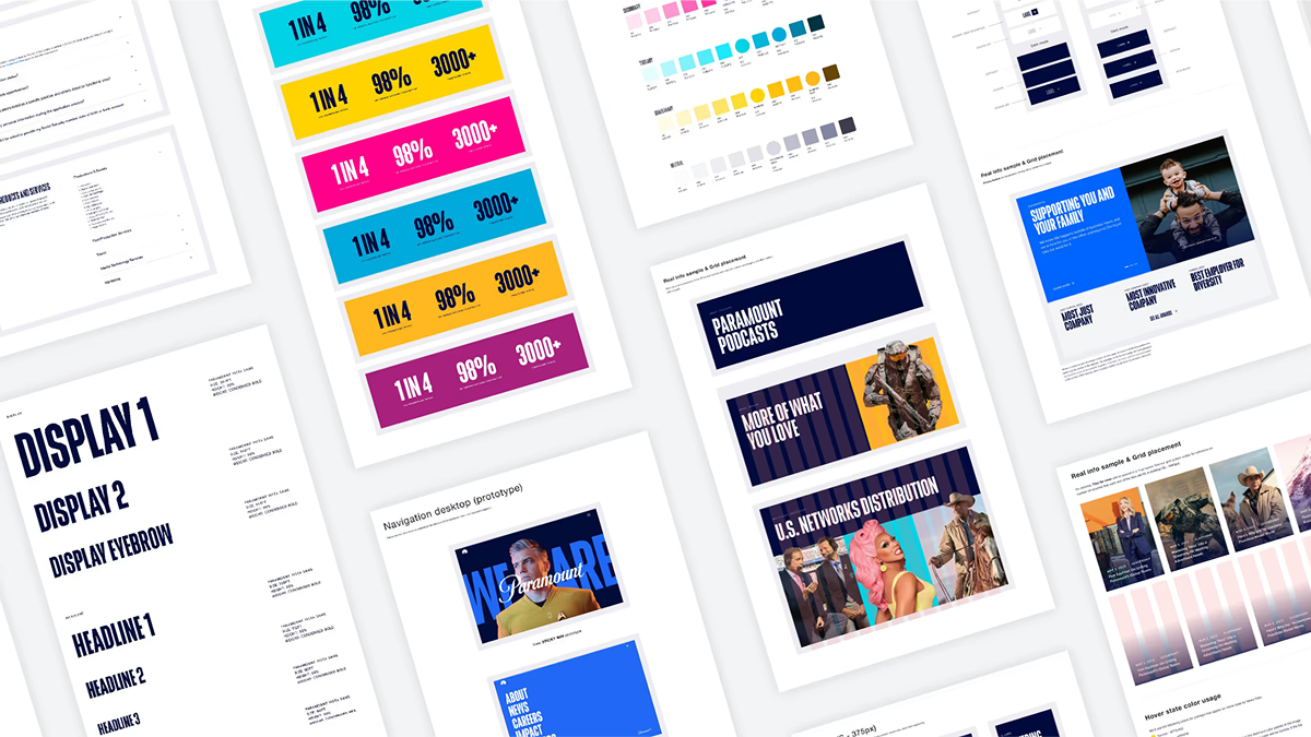
The modular design system — brand tile variants, color usage across 5 schemes, component anatomy, hover states, and responsive grid specs.
Building the system
Eighty-four screens weren’t designed individually. They were assembled. At the core was a modular system: flexible templates, brand-aware components, color schemes that could shift the required tone.
Each audience section had its own expression, but shared the same underlying grid, interaction logic, and content hierarchy. The system didn’t standardize creativity. It contained it.
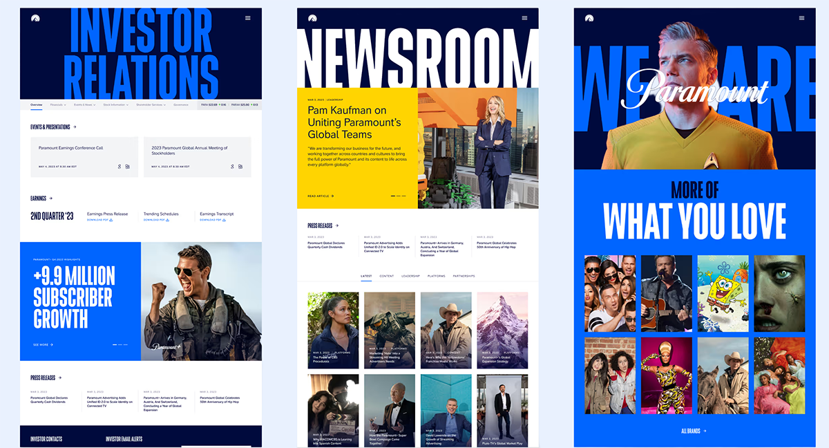
What launched
A rearchitected paramount.com. Five audience sections. One coherent structure. A modular system the internal team could scale independently.
The brand had range.The experience held together.
"The new paramount.com showcases our creative leadership, modern brand identity, and vibrant culture. The design system and digital experience that Beyond created is scalable and flexible, enabling us to meet the needs of our audiences and stakeholders — both now and in the future. And what's more, the effort felt like a true, collaborative partnership from start to finish."
Lauren Streib — Vice President of Content, Paramount