All work

Beyond Agency · White-Label Design System · Client Redesign Foundation · 2021

The system underneath every project.
Role

Design System Lead — Architecture + Components

Type

White-label · Multi-mode · Internal system

Stack

Figma · MUI · 8pt grid

Year

2021

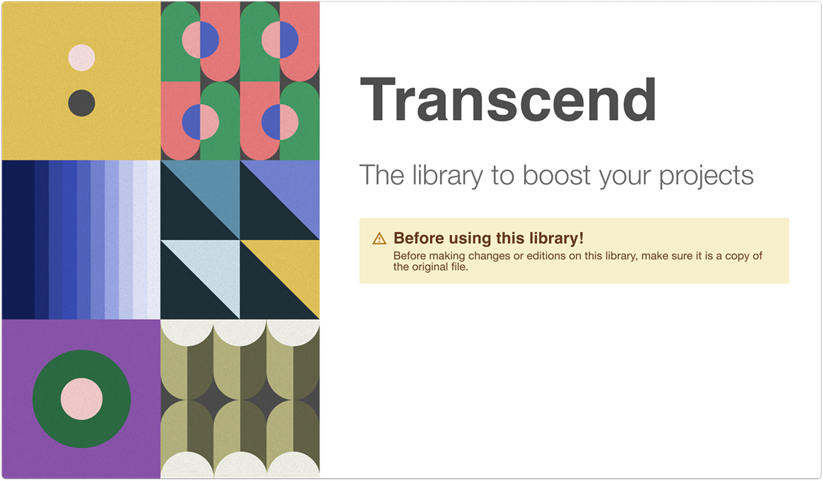
Transcend Design System overview
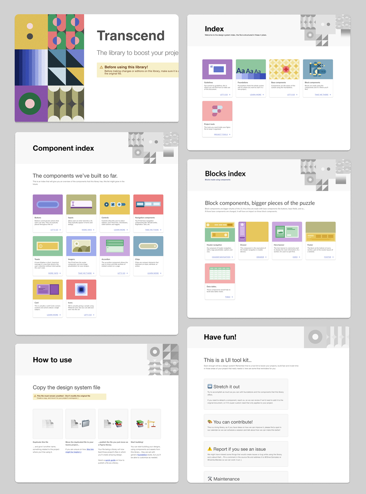
5 Pillars — Guidelines, Foundations, Components, Blocks, Tools
6 Design principles guiding every decision in the system
Client projects launched from this foundation

A foundational system built to accelerate client redesigns flexible enough to disappear into any brand, structured enough to hold everything together.

The brief

At Beyond Agency, major client redesigns often started from zero — rebuilding patterns, redefining components, and renegotiating workflows every time. It slowed teams down and introduced unnecessary inconsistencies.

Transcend was created as a foundational, white-label design system that could serve as the architectural starting point for any client project. Not a rigid visual language, but a scalable framework that accelerated concept phases and supported full redesigns.

I was involved from early concept discussions, helping define how the system would support real client work. Once the direction was clear, I led the design system architecture and component foundation.

Built on five pillars

The system was structured into five interdependent layers — each one feeding the next. Together they covered everything from the first design decision to the final developer handoff.

01 · Guidelines
How to use the system
Onboarding docs, agreements, naming conventions, and collaboration protocols. The rulebook that kept every designer aligned from day one.
02 · Foundations
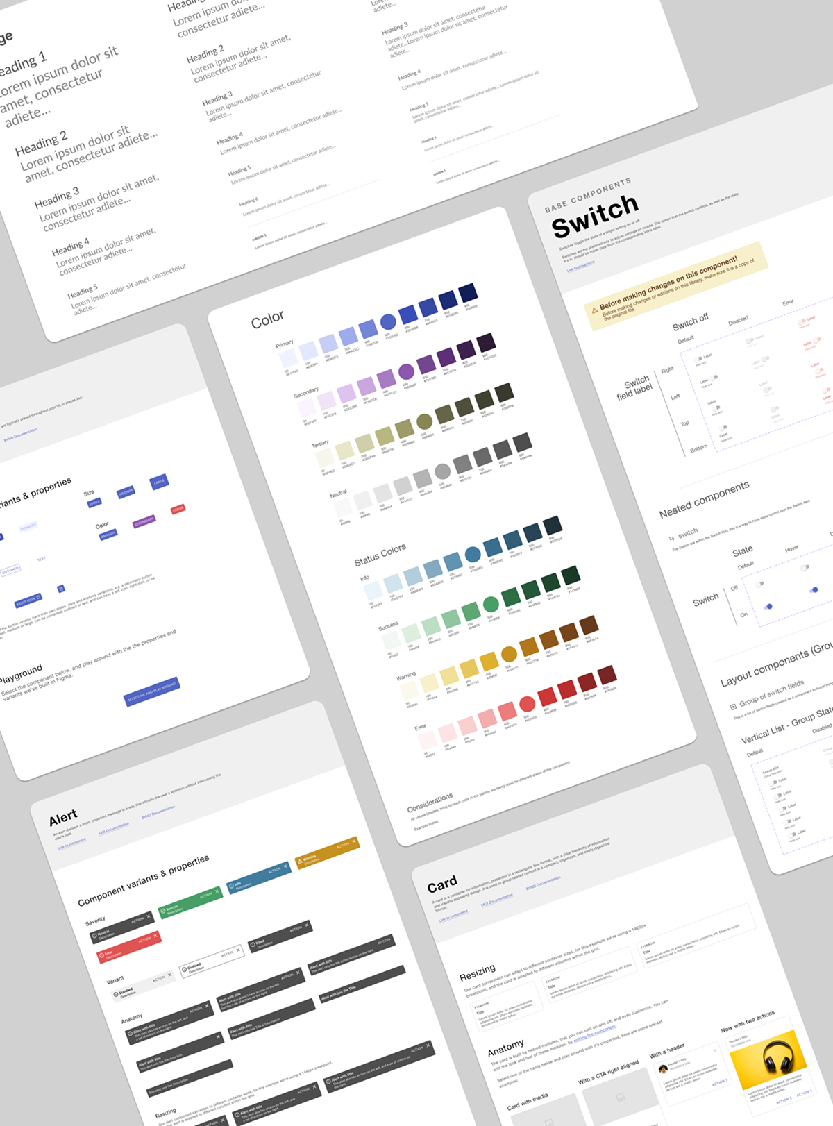
Typography, color, spacing, elevation
The design tokens that feed every component. Swap the foundations, change the brand — everything downstream adapts automatically.
03 · Base Components
Atoms of the system
Built on MUI, with variants, properties, and dev-aligned naming (snake_case). Buttons, inputs, chips, toggles — all with autolayout and interaction states.
04 · Block Components
Organisms built from atoms
Navigation bars, footers, cards, data tables — composed from base components. Blocks are where the system starts to look like a product.
05 · Project Tools
Everything that keeps the file organized
Version control conventions, QA protocols, accessibility checklists, and the living task manager that tracked system evolution. The tooling that made the system a real product, not just a Figma file.

Six principles, not just rules

The system was governed by six design principles — not aesthetic preferences, but operational commitments that shaped every architectural decision.
01
Provide Scalability
Built as a foundation — every decision made to be built upon, never to become a ceiling.
02
Ensure Flexibility
Adaptability at every level. White-label by design, not as an afterthought.
03
Keep it Simple
The system should improve workflow, not complicate it. If it creates friction, it gets redesigned.
04
Empower the Team
A system that boosts process, not one that requires guardianship. Every designer should feel ownership.
05
Encourage Collaboration
A common visual language across design and engineering — reducing friction at handoff.
06
Ensure Quality
Visual and technical standards baked in — accessibility, consistency, and dev-readiness by default.
System index — 5 pillars Foundations page

The Transcend index — 5 entry points, each color-coded, each a self-contained layer of the system.

Foundations — typography, color palette, elevation, baseline grid, and layout grid all defined as Figma styles.

More than components

This wasn’t just a UI kit. It required alignment across stakeholders, designers, and developers. I facilitated discussions around naming conventions, file structure, accessibility standards, and handoff expectations, ensuring the system reflected how teams actually worked.

Every constraint was intentional. Every agreement reduced friction. The system wasn’t static, it evolved alongside the projects it supported.

8pt grid — no half pixels
All spacing, sizing, and positioning in multiples of 8. Some edge cases allow multiples of 4. Consistency enforced at the unit level.
snake_case naming convention
Layer names mirror code — reducing the cognitive gap between design and engineering during handoff.
Autolayout everywhere
Standardizes spacing, enables quick iteration, and makes components responsive by default — not by exception.
Component anatomy mirrors MUI code
Named as close to MUI's implementation as possible. When the code changes, the design already speaks its language.
Only use resources from this library
No importing styles or components from other libraries. If something is detached, it gets reviewed and — if needed — added to the system.

What it changed at the agency

Transcend changed how Beyond approached redesign work. Concept phases became faster because teams weren’t debating foundational decisions, they were solving the actual client problem.

It reduced design–engineering friction, improved onboarding for new designers, and created a shared language across projects. The system became infrastructure, invisible but essential.

It proved that strong systems don’t limit creativity, they can enable it.

"This foundational design system not only streamlined our project initiation but also bolstered our efficiency and cohesion across all agency endeavors."

Beyond Agency — internal documentation
Next project

Health Management System